On any commercial photo shoot the art director is equally as important (if not more important) than the photographer. Sure, there'd be no photo at all if the photographer didn't point the camera in the right direction and light everything properly, but how the products are laid out and color coordinated can have a huge impact on the effectiveness of the final image.
The most common way to photograph products is to place them on a plain backdrop and fire away. There's nothing inherently wrong with this since it generally displays the product well, but you want to do more than simply display your product or service on your website. You want to sell it.
In this article we'll look at photographs from Weebly customers and discuss what makes their images great using three different factors that impact the quality of an image: environment, color and composition.
In this article we'll look at photographs from Weebly customers and discuss what makes their images great using three different factors that impact the quality of an image: environment, color and composition.
Environment
If a customer can envision themselves happily using your product, they'll be much more likely to buy it. One way to help them do so is to display that product either in use or out in the environment where it'll be used. With some simple staging, Eve Restaurant achieves both goals with aplomb.
To entice a customer out to a restaurant, it's helpful to accomplish two things:
Pickert Family Farm sells Maple Syrup, and the photos they display of the product are straightforward: bottles up against what appears to be the walls of a barn. While those images are very good, it's not those images we want to focus on here. Instead let's look at the gallery that appears a little bit further down on their homepage:
- Make the food look delicious.
- Make the location look like it's worth a visit.
Pickert Family Farm sells Maple Syrup, and the photos they display of the product are straightforward: bottles up against what appears to be the walls of a barn. While those images are very good, it's not those images we want to focus on here. Instead let's look at the gallery that appears a little bit further down on their homepage:
The Instagram photos are a delight and truly capture the personality behind the product. By taking simple photos with their phones to give customers a look behind the scenes of their business, Pickert Family Farm has set itself apart from any syrup you can purchase at the grocery store.
Color
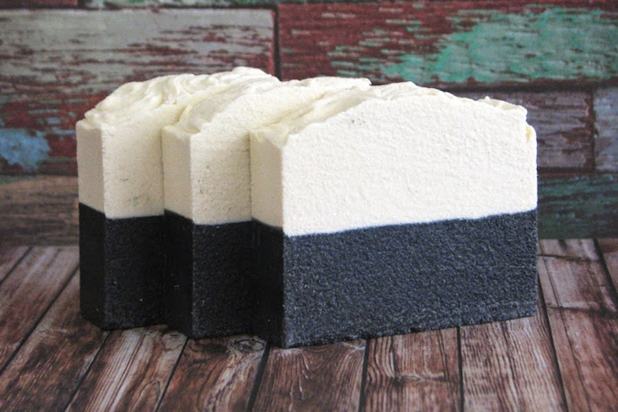
Colorful images pop. They grab the viewer's attention. When you have someone's attention, it's much easier to close a sale. Something that Artisan Bath & Body appears to understand very well (header image).
Their site is full of colorful images. Blues and greens and reds that make being clean as enticing as sitting around in your pajamas all day eating pizza and birthday cake.
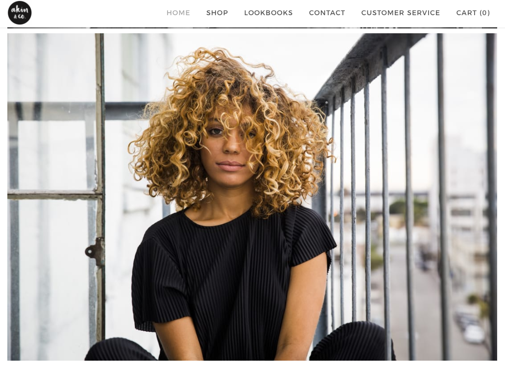
The use of color isn't limited to just bright or saturated images though. Akin & Co use images that feel vivid even with a subdued, faded color palette.
It's less about the specific colors you're using and more about:
You're probably not an art director or color theorist, so ensuring you have a set of colors that works well may be confusing or intimidating. A good starting point to better understand how colors work together is to use an app like Colors that can display a near infinite collection of helpful color combinations.
Improving the color of your images can even be as simple as using an app like VSCO or even Instagram. Adding a filter and adding some saturation to an image can often be a fast way to improve it.
- How well the colors work together.
- How saturated and vibrant those color feel. Akin & Co's images have a lot of gray, but that gray feels bright and alive.
You're probably not an art director or color theorist, so ensuring you have a set of colors that works well may be confusing or intimidating. A good starting point to better understand how colors work together is to use an app like Colors that can display a near infinite collection of helpful color combinations.
Improving the color of your images can even be as simple as using an app like VSCO or even Instagram. Adding a filter and adding some saturation to an image can often be a fast way to improve it.
Composition
The most beautiful colors and best environments in the world may not lead to a great image if it's not composed well. There are three things that you need to consider in composition:
Placement
Where you place your product within an image will be partially dictated by the environment in which you're placing it, but you'll still want to consider an important photographic rule that forms bedrock of most well composed images: the Rule of Thirds. This rule breaks an image into “thirds" both horizontally (left, right and center) and vertically (top, bottom and center), creating a grid of nine equally sized sections to guide you as to where you should place the important elements of the photo.
We could easily write an entire article about the Rule of Thirds, but why do that when hundreds of entire articles have already been written about it. Wikipedia provides a good starting point for understanding the basics of it, and Petapixel takes an even deeper look at how to put it to use in your own photography.
Depth
Take another look at this photo from Eve Restaurant:
- Placement
- Depth
- Angle
Placement
Where you place your product within an image will be partially dictated by the environment in which you're placing it, but you'll still want to consider an important photographic rule that forms bedrock of most well composed images: the Rule of Thirds. This rule breaks an image into “thirds" both horizontally (left, right and center) and vertically (top, bottom and center), creating a grid of nine equally sized sections to guide you as to where you should place the important elements of the photo.
We could easily write an entire article about the Rule of Thirds, but why do that when hundreds of entire articles have already been written about it. Wikipedia provides a good starting point for understanding the basics of it, and Petapixel takes an even deeper look at how to put it to use in your own photography.
Depth
Take another look at this photo from Eve Restaurant:
Notice how the food is in focus, but the rest of the photo is either partially or entirely out of focus. Meaning the image has a shallow depth of field. It not only makes the image look nicer; it also helps you focus on the primary subject: that delicious looking bowl of food.
Ideally you'll want at least a somewhat shallow depth of field for your own images. Newer point-and-shoot cameras, micro 4/3 cameras, and DSLRs can all accomplish this kind of look. Some newer phones, like the iPhone 7+, can also do it.
Angle
Using the same Eve image above as our example, notice how the shot is angled so the bowl isn't shown straight on; the camera is slightly above it, and also tilted down and to the left.
There is no real rule for using angles, but it's good to play around with them. Try shooting a product from the side, from down looking up, from up looking down, from closer, from farther away, from any which way but loose, and you may find a great shot that you didn't even realize was there.
At the end of the day, the whole goal of your website and product photography is to make sales. Use the tips above to take photos that best capture what you're selling and tell the story of what makes your products great. It's an eye-catching way to draw in new and existing customers.
 Ezra Meyers Ezra is a freelance writer focused on web development, email marketing and baseball. He lives in Los Angeles, but wishes he lived in Tokyo.
