Practically every visitor to a website arrives there via its home page. Yet, for many small sites, this page is often poorly thought out since it's not entirely clear what goes there. How can you create an effective home page design when you're not even sure what to put on it?
Other common pages are more obvious:
About page? Talk about yourself or business.
Contact page? Provide contact info.
Store page? List a bunch of products you'd like people to buy.
So then, what about your home page?
The short answer is your home page should briefly tell visitors exactly what it is you do, and quickly direct those visitors to the action you most want them to take while they're on your site.
To get started, write one to two sentences describing the service or products you provide. The shorter this description, the better. Then add it to your header or place it directly below.
Let's take a look at two Weebly customers to see how they improved home page design to attract action and more sales.
Kuju Coffee
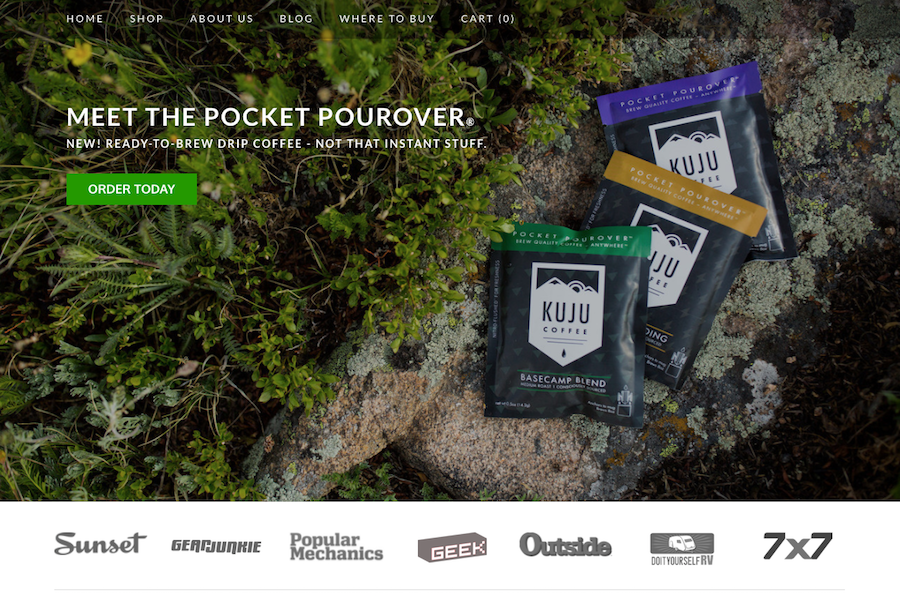
Kuju Coffee's home page packs a powerful punch. The header image shows off their product in the very type of environment customers are likely to use it, alongside a summation of that product: “Meet The Pocket Pourover: New! Ready-to-Brew Drip Coffee - Not That Instant Stuff" They also include a call-to-action button right in the header. Should someone want to make a purchase based solely on the image and tagline, there's an “Order Now" button right there.
But for those visitors who want more information, they next show off the various places where they've been highlighted in the media. Then for anyone who asks “How exactly is this different from any other pourover?" they provide a simple three step guide.
But for those visitors who want more information, they next show off the various places where they've been highlighted in the media. Then for anyone who asks “How exactly is this different from any other pourover?" they provide a simple three step guide.
Take Action
Make a list of questions you expect your customers to have about your product or service. Choose the one you consider the most important. Find a simple or creative way to answer it on your home page.
Make a list of questions you expect your customers to have about your product or service. Choose the one you consider the most important. Find a simple or creative way to answer it on your home page.
The Wilson School
The Wilson School, as the name very strongly implies, is a school. This doesn't mean ideas from their design can't be applied to your business. There are a couple of notable differences from what we've already seen:
First, they're using a video for their header. A well edited reel that shows several quick clips highlighting what makes the Wilson School stand out. From the moment we land on the site we can see that this school is unique and not like other schools.
Second, they've chosen to forego having a separate home page, instead choosing to have their about page act as home. Why have two different pages when one of them will suffice? This is extremely easy to do in Weebly. All you have to do is visit the Pages tab, look at your Page list on the left, and drag whatever page you'd like to use as your home right to the top of the list. Done.
Take Action
Ask yourself how you're different from your competitors. Consider ways through image, video or description that you can immediately establish those things that set you apart. Then ask if combining your home page with another page on your site makes sense. The fewer steps a potential customer needs to take in order to learn about you or make a purchase, the better.
 Ezra Meyers Ezra is a freelance writer focused on web development, email marketing and baseball. He lives in Los Angeles, but wishes he lived in Tokyo.


