Have you ever sat through a writing class where the teacher or professor trotted out that old adage, "Show, don't tell?" You can completely forget about that now. This is the internet in 2016, and you've got less than thirty seconds to communicate what your site's visitors need to do.
Good copy is the key
Whether you've built a website to market your small business or as a platform for your blog, there's a reason your site exists. Whether it's for customers to purchase goods for sale, subscribe to an email newsletter, or to read more of your awesome content, your website is a call to action.
Clever copywriters know that there's nothing more important on a page than a call to action. In simple terms, a call to action is a statement that directs a reader to do something: purchase, subscribe, read more. Usually call-to-action statements are set apart from the rest of your page copy—bigger or bolder, or formatted in button or “clickable" form.
Think of a call to action as the final note you leave to your visitor. It's the takeaway—the main thing you want them to do before leaving your site. It's the most important reason your website exists and it's likely the driving force in your business. Every page on your website is an opportunity to guide your guests to close the deal, but there are a few considerations for crafting an effective call to action.
CTA dos and don'ts:
Only include one call to action per page
Choice fatigue is a real thing—and it could be costing your business. Marketing psychology research indicates that when your site visitors are overwhelmed by the available options, they are less likely to make a decision. So while it may seem like giving your visitors many choices for action (read our blog! Subscribe to the newsletter! Learn more! Buy now!) will keep them engaged, it could actually be hurting your conversion.
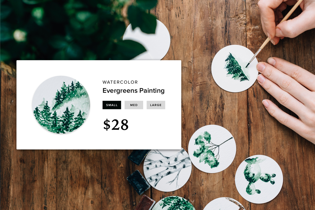
Instead, include one strong call to action per page. For example Readydesk invites you to shop now. That is the main action to take on this page. You actually have to dig for more options, which makes you more likely to just click the shop button.
Use positive and actionable language
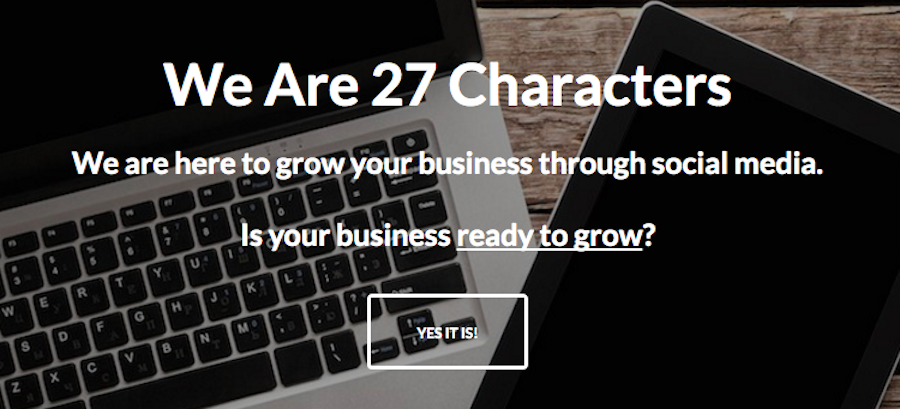
27 Characters is a social media consultancy that uses actionable language. By focusing on imagery familiar to individuals running an online business, their call to action seamlessly integrates into the site experience. Not only that, but their message of "ready to grow?" is appealing for struggling entrepreneurs and business owners.
Did you know there's an entire body of research dedicated to discerning the highest converting words? Using power-words like "free" and "now" and "learn" may seem trivial, but after years of exposure to marketing messaging, our brains are actually wired to respond to these words — using them will supercharge your marketing copy.
Don't be indirect or try to soft sell
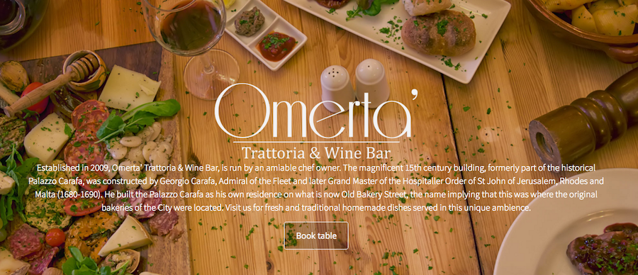
Omerta's beautiful restaurant website's call to action is unabashedly straightforward. “Book a table" is the main action visitors can take. There's literally no ambiguity, and once a visitor has gone through the great copy blurb above the button, they can easily decide whether or not that action is the right one for them to take.
Don't undermine your site's purpose by sending mixed messages
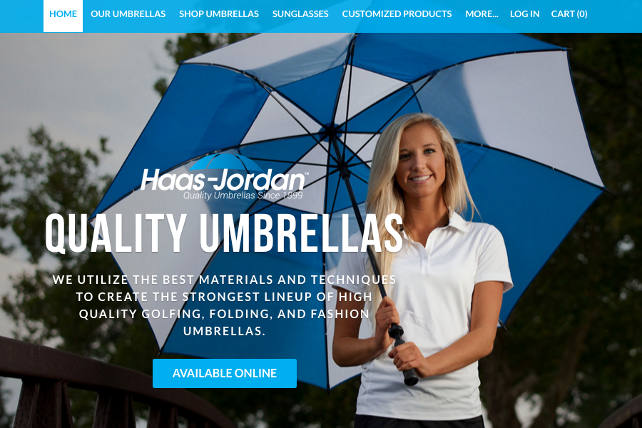
Hass-Jordan is a fantastic example of a site with a clear purpose. There's no reason to direct visitors to an about page or a page that details custom options available—the single call to action leads down a sales funnel that outlines each option with increasing complexity. This strategy makes it very easy for a visitor to say "yes" at the beginning of their buyer's journey, lessening the chances you'll lose them in the middle of a sale.
Even the design and layout of this page leads the eye from the signature golf-style umbrellas to the branded call-to-action button.
Finding that right mix of clarity in copywriting and page layout is critical for an effective call to action, but if you can nail it, you're doing your site and its visitors a huge favor. There will be no question what action you're hoping they'll take, if you spell it out and set it off. Remember, you've got mere moments to capture a visitor's interest before they bounce to the next distraction. Use their time and your resources wisely with focused call-to-action statements.
 Melissa Haney Melissa is a writer specializing in social media and web development.


