
You have a killer product but just can't seem to get anyone to click the "buy now" button. Are you making a design mistake that's impacting sales?

|
You have a killer product but just can't seem to get anyone to click the "buy now" button. Are you making a design mistake that's impacting sales?

One of the big secrets to good web design is how you use color. It's not just about picking out a nice palette. It's about choosing colors for different jobs, and then using them in strategic ways. Here are some ways to bring color to your website.
Is your website beginning to feel a little stale? A few tweaks might be all you need to make it feel new again. Today, we'll look at five easy modifications that you can make to improve the aesthetics of your site and draw in more users.
Did you know that links are more effective when they use more (but not too many) words? Did you know that buttons become more usable when they contain certain kinds of word combinations?

Designers like to talk about style guides. Style guides are helpful documents that lay out various aspects of how designs should appear and function throughout a website — like how buttons should be labeled, how forms should work, how error messages should be written and all kinds of other things. But style guides define low-level details, whether related to aesthetic or function. There's something that comes long before style guides...

In 15 years of watching people use websites and web applications, I've never once heard someone say they wished there was more text. Why is that so? And why is it that people are so prone to ignoring instructions when trying to complete tasks on a website?
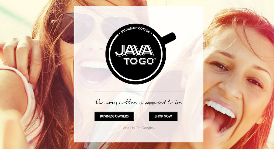
When it comes to website design, large images make powerful statements. Hero headers — full screen images used with text or navigation elements at the top of a website — work because a great visual draws in visitors while simple text, navigation and branding help keep them looking at your site. Here's how you can make the most of a hero header in your next website design.
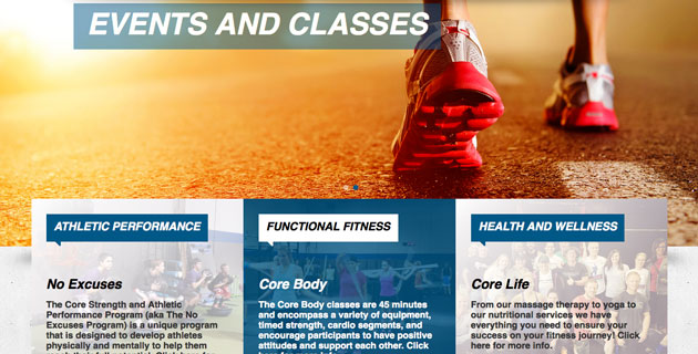
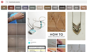
The use of cards and tiles is a popular website design trend. This framework is effective because it has a clean and organized look and feel while easily adapting to a variety of device sizes. But you don't want to create a design that looks like Pinterest. A card-style framework should be unique and highlight your brand. Here's how to do it.

At Hack the Hood, an Oakland based tech-career education and readiness program, young people learn how to structure and craft websites, gather digital assets, and work with small business clients to create simple and effective designs. With the help of lead instructor Max Gibson I’ve developed a list of basic principles from our curriculum that can help anyone make a successful website.

The holidays are upon us, and more than ever people are ditching the horrible mall traffic to shop from the comfort of their favorite internet browsers. Folks are opting out of the holiday hustle and bustle, and statistics are proving it! This year’s online store holiday sales in the US are expected to to hit $105 billion, which is an 11% increase from last year.
What does this mean for you? If you have a product to sell, now is the absolute best time to take advantage of an online store for your website. From a design perspective, there are a few tips to keep in mind that can convert your online store visitors into paying customers. |