Organize Your Information by Importance
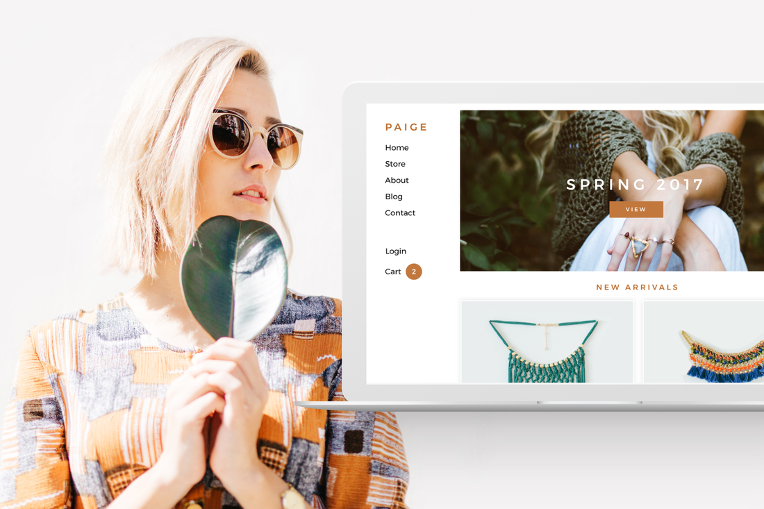
You'll want to put your most important information above the fold—this means placing it high enough on the page that a visitor won't have to scroll to find it. Weebly has designed themes with this in mind. If you take a look at all the business designs, the brand tagline or call to action is first and foremost.
Don't Obscure Your Intentions
The goal may be less obvious for some pages. Do you need to collect emails for your primary marketing efforts? Do you need to register users for a webinar sales funnel? Are you trying to sell your e-book or get visitors to schedule an appointment? What you want to avoid is doing all of those things on the same page. When given too many choices, a website visitor will feel overwhelmed with options and is more likely to leave than try and figure out what they want.
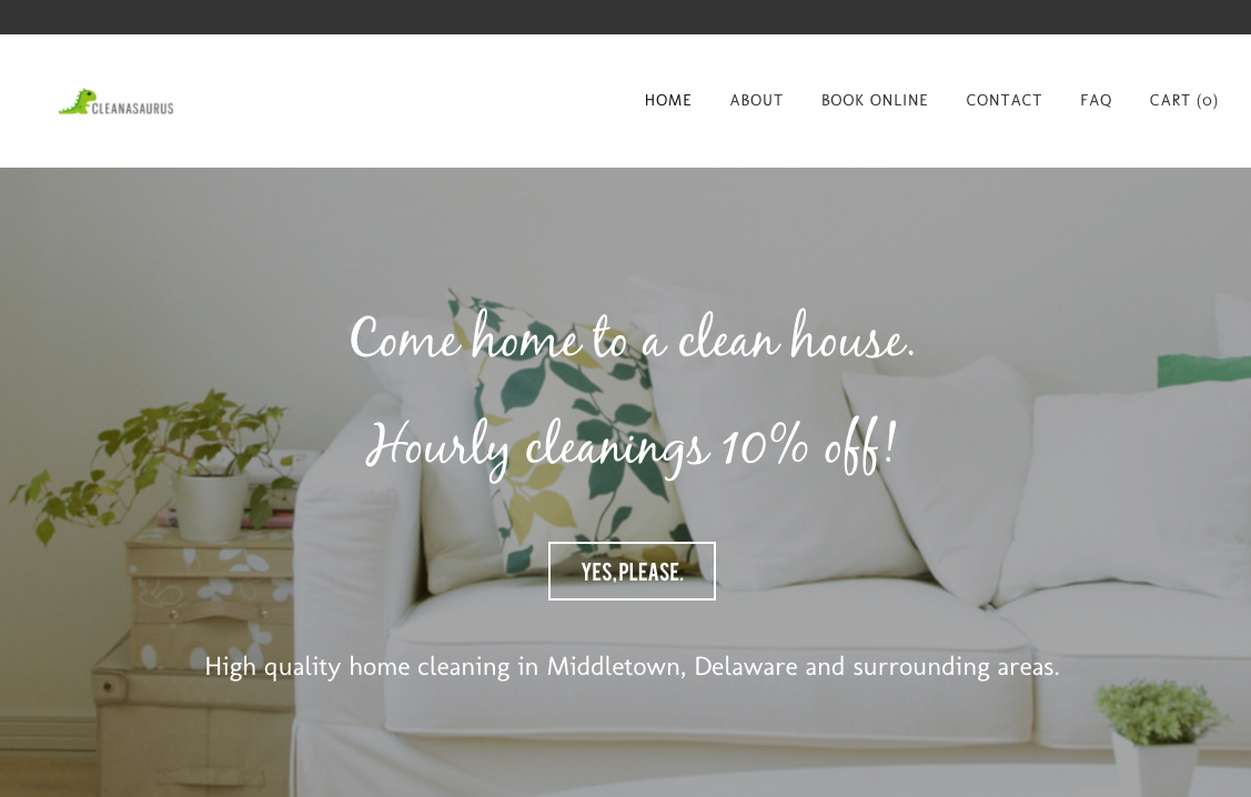
Cleanasaurus has a wonderfully simple, lean design. Each page has a clear intention and guides a visitor from lead to conversion intuitively.
Make Use of Color Cues in Your Designs
For example, all of the call-to-action buttons on your site should be the same color—and you won't want use that same button style to link to your about page or blog. Or you might put all your testimonials on a grey background, separated from your service descriptions on a white background. This one simple trick helps your visitors understand and navigate your content.
Don't Run Out of Steam at the End of Your Pages
What you want to avoid is placing an exciting hero image at the top of a page, followed by paragraphs of dense copy that will overwhelm and fatigue a user. If your pages are running out of steam by the time you scroll to the bottom, assume your visitors are already bored.
Leave Your Visitors on a Strong Note at the Bottom of the Page
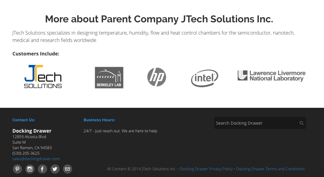
Take a look at how Docking Drawer uses the footer to invite visitors to contact them. Their call to action in the footer is “Just reach out. We are here to help." And that simple copy makes a real impact on user sentiment.
Ready to get started? Lets go.


 RSS Feed