What are some recent trends you might to apply to your own site?
1. Loooong Scrolling
The function and size of mobile devices make it more convenient to scroll through content instead of pressing on tiny navigation links that we're meant to be clicked with a mouse. Less pages and more scrolling simply work better in this context.
That said, you still have to account for the roughly 44% of your traffic that's coming in from a regular web browser. A long scrolling page can work just as well for these visitors, but it's important that the page remain visually interesting throughout to keep them engaged.
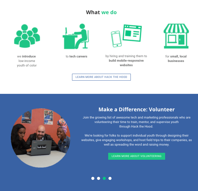
Take a look at Hack the Hood. They've implemented long scrolling across many of their pages but ensure it works well for all visitors through their design approach. They've used Sections to alternate the background across individual pages from blue to white to photographs and back again.
Sections are simple to use. You simply drag a section to a page, as if it were a standard element and then add other elements to it. You can watch a short video and read all about Sections here.
2. Grid Design
If you're not a designer, the notion of laying out an appropriate grid might seem either daunting or boring (or both). Especially since being a few pixels off here and there can really wreck your design in some cases. It's a good thing, then, that you don't need to worry with setting up your own grid. You can rely on Weebly's preset layouts throughout your site, nearly all of which use grid design.
Whenever you drag a Section to a page, Weebly prompts you to choose a layout (or to leave that section blank). Unless you're simply planning to add a single photo, video, or a block of text, always choose one of the layouts as a starting point even if it doesn't fit exactly what you're trying to do. You'll be able to replace the preset elements with different elements (and add to what's already there), while maintaining the grid itself.
3. Vibrant Color Schemes
4. Header Background Videos
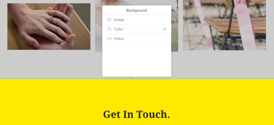
As already noted, Sections allow you to use any image, color or video as a background throughout your site. This same feature is available in the header area (for Pro subscribers and up).
When you select a video, you can choose from preloaded videos provided by Weebly or upload a video of your own. Header videos are a quick way to show what your brand is about or to show off your products/services, but if you upload a video of your own, there are a few best practices to note:
- The video should be short. Uploading Fellowship of the Ring as a background would not only be a terrible infringement on JRR Tolkien's copyright, but would also be about three-and-a-half hours too long. Your video should either be several short scenes that are cut together (like our homepage) or a single scene of around ten to twenty seconds that looks interesting when run in a loop.
- The video should either be fairly bright or fairly dark, so that it strongly contrasts with any black or white text you place over it.
- Don't include audio. Auto-playing videos should never play audio since it'll annoy all of your visitors who happen to be listening to something else while web browsing (which is most of them).
Apply some of these trends to your own site and you won't just look as good as the bigger sites, you may look better. That'll keep customers coming back again and again.
Ready to get started? Lets go.


 RSS Feed