This same theory and concept applies to your business and website. Every brand needs a color palette that tells users who they are. This palette often consists of one dominant color, which is the most used color, and two to three secondary colors. Brand colors should be used everywhere the brand is mentioned and throughout a website design.
Further, each color should have a purpose in the design. The dominant color will likely appear in the logo, images and headline text. Secondary colors are for everything else, from buttons to the underline color of links.
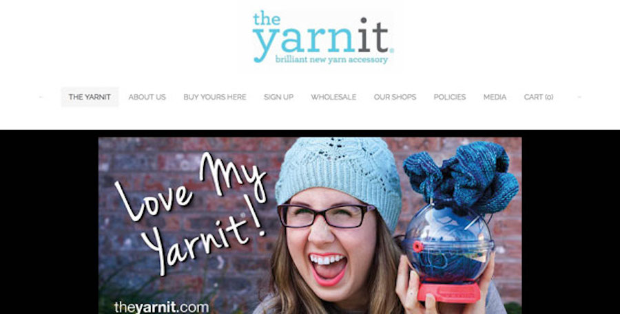
Try it: When you think of your brand, what color comes to mind? Start building that color into your brand imagery and logo. For inspiration, check out the way the The Yarn It uses light blue throughout the main pages of the site. You can also use the Brand Genie App to create a custom logo in just a few steps.
Color Psychology
In terms of how “loudly" a color speaks — brighter and more saturated colors have the most powerful associations. Colors that are tinted, or mixed with white for a more pastel look, are less forceful. Colors that are mixed with black or gray also have a muted effect, but carry more meaning than their lighter counterparts.
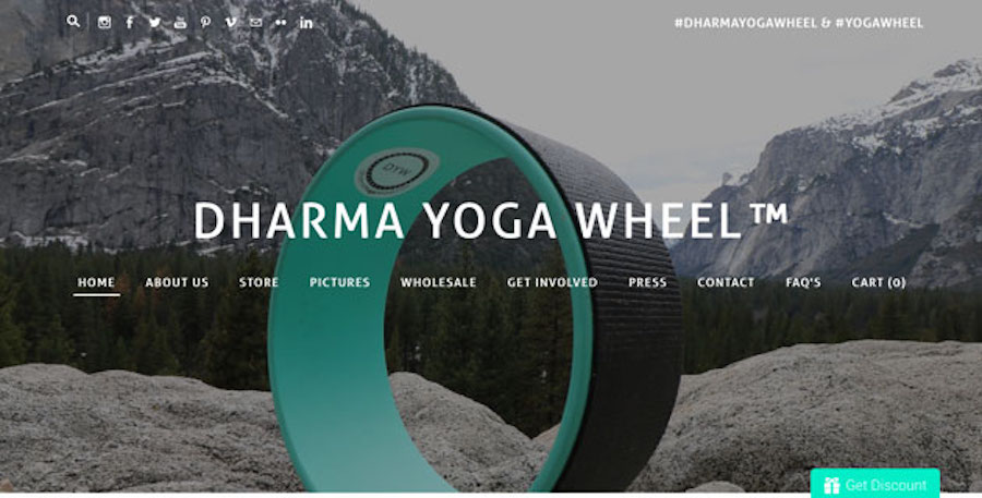
Try it: Emphasize distinct color choices by using muted colors or a canvas that's black or white, in the way of the Dharma Yoga Wheel. The toned down colors in the image against the bright product with all white accents is striking and eye-grabbing.
Here's a look at the most common color associations for primary and secondary colors:
- Red: Heat, passion, love, aggression, energy, danger; said to increase the appetite and is a popular choice for restaurants
- Orange: Sun, energy, balance, caution, excitement, aggression; popular as a secondary color and for elements such as calls-to-action in website design because it is attention-grabbing
- Yellow: Sun, optimism, hope, cheerfulness, caution, learning; demands attention and is popular among companies that want you to pause and look
- Green: Nature, health, environmentalism, jealousy, money, growth; popular option for brands that want to connect to the Earth or sustainability
- Blue: Trust, serenity, cleanliness, order, cold, masculinity; the most popular “big" brand color in the world because of it association with trust and universal appeal
- Purple: Regality, mystery, spirituality, arrogance, beauty, creativity; least used brand color because meanings can be so mixed
Try it: You don't have to use a lot of color to make an impact. The simple red logo for Adirondack in-a-Box demands attention and also plays off the coloring of the wooden chairs they create.
Customization
The right color can tell a website visitor a lot about your website and brand. It can help set the tone and feeling they have about your website, content or products, and create a positive (or negative) emotional connection. Do you have a site that uses color and design in unique ways? Share it in the comments!
Ready to get started? Lets go.


 RSS Feed