Whether you're just getting started or going back for a big redesign, one of the biggest web design challenges involves finding the right typeface—there are just so many to choose from. While you may be tempted to use them all, the best websites focus on just one or two stellar fonts.
But how do you pick the right one? Here are five tricks to try (and the best part is that every one of these fonts is available in the Editor).
1. Go for Readability
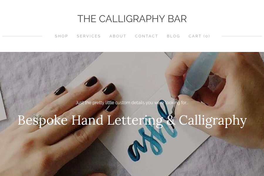
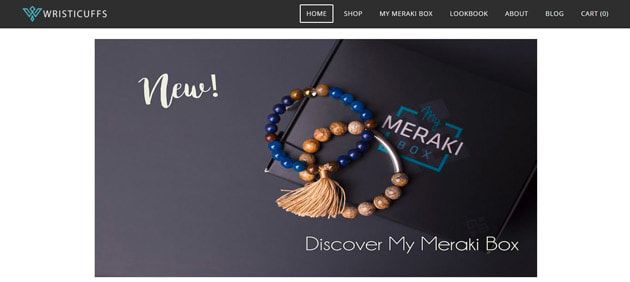
https://www.thecalligraphybar.com/ (pictured above)
The No. 1 rule of professional typography is that it must be readable. Professional typographers know when to use a bold or novelty display typeface versus a lighter, albeit more plain, option for body copy.
When it comes to readability, typefaces should be easy to scan at a distance and provide a clear distinction between letterforms. Fonts should be large enough and contain enough space between lines so that letters don't look cramped or tight, but not so much that users have to think about what the words say.
A highly readable typeface also has a clear distinction between upper- and lowercase letters, such that the x-height (height of lowercase letters) is shorter than its uppercase counterparts.
One of the best ways to think about readability is the I/l/1 test. Put an uppercase “I," lowercase “l" and the number "1" side-by-side-by-side. Can you discern the different characters?
Fonts to try: Roboto (sans serif), Georgia (serif) or Lobster (decorative)
2. Look for Uniform Stroke Widths
A medium (or regular) uniform stroke width is easy to read in a number of sizes. Simple typefaces with rounded shapes and uniform strokes are simple, identifiable and work well for smaller text such as body copy or microcopy in buttons, navigation or calls to action.
Alternating thick and thin strokes in the same letters might look more interesting but can be a little tougher on the eyes. (Save those for headlines or headers.)
Fonts to try: Ubuntu (sans serif), Merriweather (serif) or Komika Axis (decorative)
Alternating thick and thin strokes in the same letters might look more interesting but can be a little tougher on the eyes. (Save those for headlines or headers.)
Fonts to try: Ubuntu (sans serif), Merriweather (serif) or Komika Axis (decorative)
3. Don't Go Too Thin (or Thick)
Exaggerated font styles, such as letters that are very thick, very thin, or have wide or ultra-condensed stances can impact readability.
Thin letterforms, for example, only really work with dark type on a light background and can look a little strange from the backlighting of a computer or phone screen.
Extra wide or thick letterforms can weigh down a design and force the copy to include a lot of line breaks, disrupting reader flow.
Opt for something in the middle. You'll know these typefaces because they will often contain a cue such as “regular" or “medium" in the name. You'll most likely want to avoid “ultra-condensed," “ultra light" and “black" options.
Fonts to try: Lato (sans serif), Alike (serif) or Berkshire Swash (decorative)
4. Pick One Bold and One Light Option
A trick the pros use when putting together design projects is to pair two typefaces with different weights. Use a bold, heavier typeface for the display elements and a more simple light weight for body copy and captions. This creates a distinct hierarchy that leads users from the most important text first (such as headlines and subheads) to the body copy.
Fonts to try: Raleway (light sans serif), Alfa Slab One (bold serif) or UglaQua (decorative)
Fonts to try: Raleway (light sans serif), Alfa Slab One (bold serif) or UglaQua (decorative)
5. Use a Sans Serif and Something Else
When in doubt, start with a simple sans serif. A sans serif typeface is one that includes simple strokes without extra divots at the ends of letters. Sans serifs are highly readable and are a solid option for body copy on the web. A nice thing about sans serifs is that many take on the characteristics of surrounding elements.
However, the downside is a sans serif in itself can be a little boring. Pair it with a display or novelty option that fits your brand style a little more. (It will look interesting when paired with a funkier option or stand out more when paired with a heavy typeface.)
There's no rule that you have to use all sans serifs or serifs; you really should branch out and try to pair typefaces of different styles. The trick to making sure they match is to look for letterforms with a similar shape. Use a lowercase “o" as a starting point. What does the inside of the letter look like? Is it perfectly round or more oval? Straight up and down or with a slant? Pair typefaces of different styles, but that have a similar “o" shape for the best results.
Fonts to try: Seaside Resort (decorative) and PT Sans (sans serif) or Patua One (serif) and Molengo (sans serif)
Conclusion
Less is more when it comes to typography. Stick to a simple palette with just one or two typefaces in one or two styles for the best results. Make sure the typeface you choose matches the tone of the images and messaging in the design so that it contributes to the right aesthetic for your website.
When it doubt, take a look through the theme gallery to see which fonts are paired—these templates are made so that all the elements match. Get some inspiration and jump-start your typography project today.
When it doubt, take a look through the theme gallery to see which fonts are paired—these templates are made so that all the elements match. Get some inspiration and jump-start your typography project today.
 RSS Feed