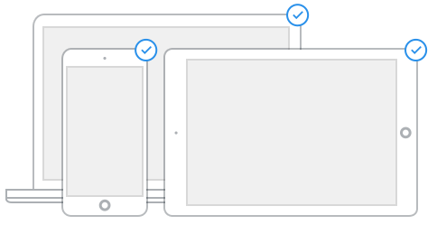
It’s more important than ever that your website, online store or blog looks amazing for every visitor on every device, so we’re extra excited for today’s launch of Squared and Bradley, our first two fully responsive themes! So whether it’s a phone, tablet, television, wearable... or whatever might come next, your site is going to look great with these new themes.
Please note: All sites on Weebly already have a mobile optimized view, but the reason these new responsive themes are special is because they keep the design style consistent between the web and mobile views.
Please note: All sites on Weebly already have a mobile optimized view, but the reason these new responsive themes are special is because they keep the design style consistent between the web and mobile views.
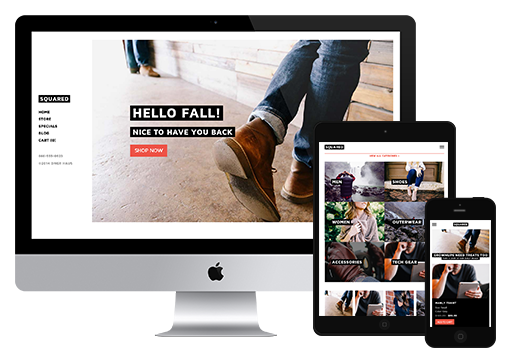
Squared
A truly diverse theme, Squared bundles a variety of strong components into a fully responsive package that translates your content beautifully on any screen. Strong on image display, product elements and blogging, Squared offers an array of impressive new design features for your site.
| See Squared in action with these live example sites: |  |  |  |
Squared also supplies some exciting new interaction opportunities for core eCommerce elements. This includes a new type of interactive menu on product categories and a full width product option that allows you to create striking product pages. Blogging features a new left-sided layout while responsive elements make use of hamburger menus to facilitate mobile navigation without sacrificing key design elements.
You can switch to Squared now from Design > Change Theme in your Site Builder.
You can switch to Squared now from Design > Change Theme in your Site Builder.
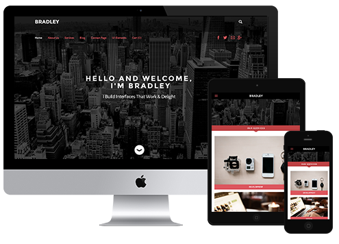
Bradley
Fully responsive and sporting some sleek new navigation and image elements, Bradley simply oozes authority and will leave a strong impression on first time visitors.
| See Bradley in action with these live example sites: |  |  |  |
Bradley sports plenty of surprises. Horizontal color blocks on tall and short headers add emphasis to page headlines, while landing pages collapse beautifully from full screen images to normal headers with some beautiful animation.
Bradley also supports a fixed navigation bar that helps visitors get around your site easily, along with a smooth search option to help uncover deep content. Some of our best button designs and hover effects are featured in this theme, so if you’re a button fan, Bradley is for you. Product elements also enjoy an impressive design overhaul that will fit smartly into professional product pages.
Try Bradley today by changing themes in the Site Builder, if you need help please reference everyone’s favorite select a new theme video.
***
Building Squared and Bradley with a responsive perspective from the start allowed us to to better integrate design elements into a multi-device world. We want to make it easy to edit these themes, so if you switch to a mobile view on desktop the mobile editor will remind you that the theme is responsive and the mobile view is a preview mode for responsive themes.
Squared and Bradley are just the start of our new responsive push, stay tuned for even more and let us know what you think about the new themes!
 RSS Feed