Use a Button
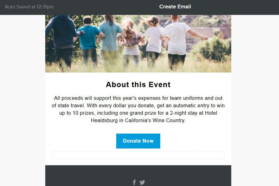
Users know how to interact with buttons, so use them in your email to encourage clicks. The call to action comes in two parts:
- Initial messaging that explains the benefit to users (such as "50 percent off" or "sign up for a free email")
- A button to perform an action
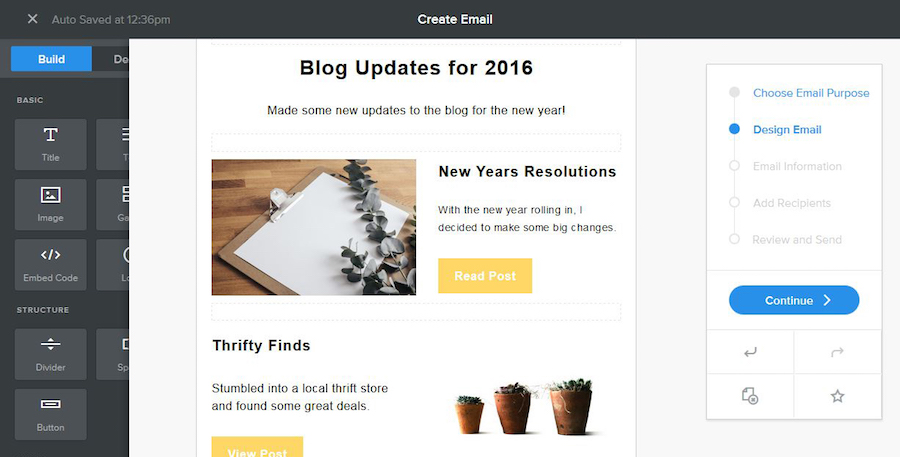
Try it: Every Weebly Promote template comes with ready to use call-to-action buttons. You can change the text or color with just a couple of clicks.
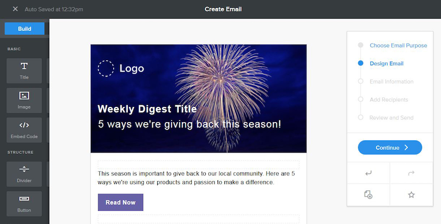
Start with a Bright Color
Don't confuse the color of buttons with other design elements. By using a unique color for clickable items, your button will clearly stand out. Just make sure that the button and text colors contain enough contrast so that any featured instructions are easy to read.
When it comes to color choice, it's ok to stick with your brand's overall color palette or select a new hue for buttons. Either way, commit to the same button color for all emails. This consistency will make it easier for users to know what you are asking them to do as soon as they open your email.
Try it: Use a color theme that connects the headline or main image and call to action. In the Editor, you can upload any photo for your email and choose from an unlimited color palette to find the perfect match.
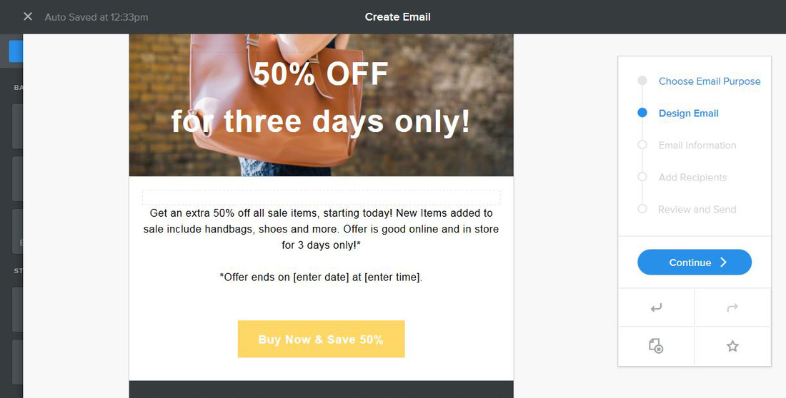
Keep Language Simple, But Fun
Use strong action verbs and encourage users to take action right away. This is why you often see phrases such as “Buy Now," “Learn More" or “Get Your Discount." These phrases leave no room for confusion about what might happen next.
Try it: Just click on any text in your Weebly Promote email to edit the copy. (This works on buttons, too!)
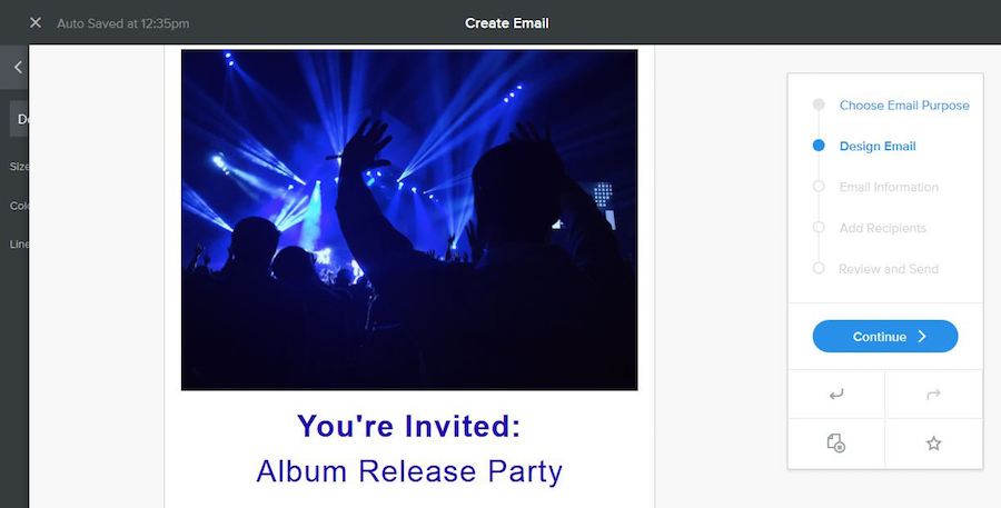
Go Bold With Lettering
Why? Because you have to get users interested enough to actually look at the email.
Opt for bold lettering that is easy to read. There's nothing wrong with using oversized typography or a color. Pair that with a call to action for two easy touch points that encourage user interaction.
When planning your email think of the order of reading as something like this:
- Headline
- Call to action
- Body type
- All other elements
- Footer information
Try it: Write a headline that dazzles, but using active verbs and simple language.
Give it Plenty of Space
If you aren't sure how much space to use, start with twice as much space as you are using to surround other elements. Think about a button in particular. It won't fill the width of the screen or space where it “lives," and there is no reason to force it. Leave the rest of the space on either side of it blank. Leave a little extra padding above and below buttons for the same reason.
The open space will help draw users' eyes to the button.
Try it: Every email template comes with perfect spacing from that start. It's an easy way to get started with your first (or 1,000th) email newsletter.
Put It in Action
Every one of these tips is something you can do right now in the Editor. If you haven't tried it yet, you can get started for free. In fact, every one of the examples above is from a Weebly Promote template, so try it out and let us know what you think!
 RSS Feed