1. Try a High-Color Illustration
To make the most of a high-color illustration, stick to a color palette as you would with any other project and pick one color as a dominant hue. This dominant color area provides the perfect place to anchor text or other elements.
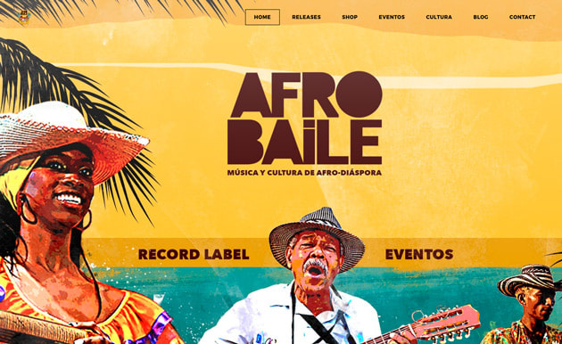
Afro Baile uses bright color to powerful effect. The dominant yellow background makes the headline, navigation elements and branding pop.
Try out different color palettes on your own site with custom theme colors.
2. Go Monotone
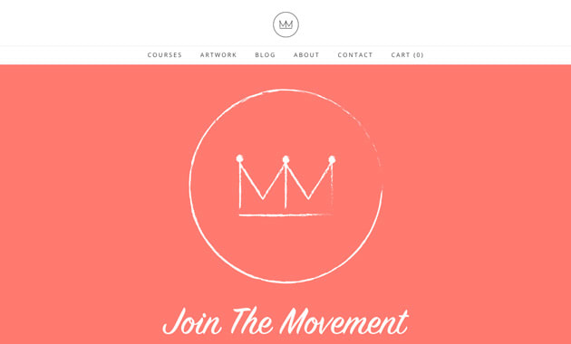
Masterpiece Makers uses a bright coral to attract visitors. The overall layout is flat in nature and uses simple imagery and typography with bright color to establish a classic, yet modern feel.
3. Pick from the Material Palette
When thinking about colors that are high-drama and engaging, try to keep options in the palette to a minimum. Often two colors will be enough to create a look that is bright and fun, but not garish.
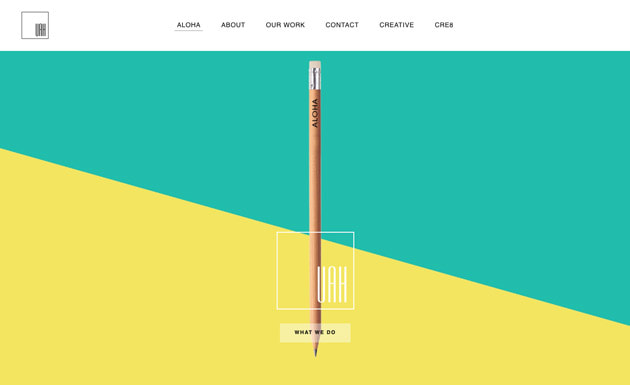
Unique Art Hawaii mixes a lemonade yellow with a teal-green to move the eye towards the branding and call to action in the center of the design. While the colors might not come to mind right away as a choice for a website palette, they work together seamlessly and create interest and establish a light, bright mood.
Want to try a Material Design-inspired color? Start with the swatches from Material UI Colors. You can enter the hex codes referenced on this page and use them as custom color choices when choosing different theme colors.
4. Try a Color Overlay
But a color overlay does not have to be boring. While many designs use a dark-tinted overlay, consider a pop of color instead for even more visual emphasis.
Tucker Antell uses a blue overlay and yellow accents to create a visually striking homepage. The color combination is modern bold and sets the right theme for the musician's website design. You create a cover overly by customizing the background of any section on your site.
5. Go with a Gradient
A two-color gradient – where colors fade into each other – can be used alone in the background or on top of an image as an overlay. Gradients can also work inside buttons or for typography as art features. Color choices for gradients can range from bright to white (or dark) or move from one bright color to the next.
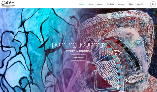
Cori Jacobs uses gradients to add emphasis to the slider on her homepage. Graduated colors help pull the eye across the screen from left to right as the color changes and makes text elements more visual and readable because they separate from the background design. Now you can create gradient backgrounds directly in the Editor to inject some additional design flavor into your content.

 RSS Feed