Creating a stellar website design is easier than you might think. However, it does take a plan. Here are design tips from a real Weebly designer on how to make an engaging and high-conversion website.
Design for First Impressions
Did you know that 94 percent of a user's first impression relates to visual appeal and simplicity?
When designing a website, that first impression is generally thought of as the home page and everything users can see without scrolling. You get one chance to entice and encourage users to further interact with the elements in this space. (And with only a few seconds of the their time.)
The things that most users look for – and that shape their first impressions – include:
- Navigation: Is it easy to see what the website is about and find information?
- Headline: Does the message appeal to me?
- Imagery: Are the images (or video) engaging and interesting?
Create Simple Navigation
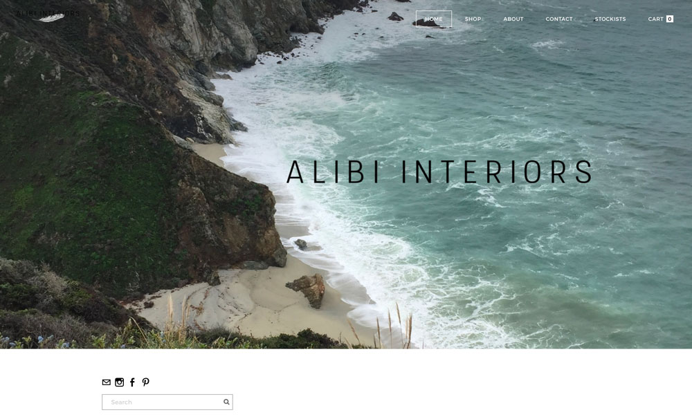
Alibi Interiors Homepage
The difference between an average and effective website design is how easy the website is to navigate. Users need to find their way around the site and understand what the most important elements are in the hierarchy of design.
That's where strong navigation comes in. Characteristics of clear and simple navigation include:
There are a few things to avoid when it comes to navigation. The key is to lead users only to what they want to do without overwhelming them.
That's where strong navigation comes in. Characteristics of clear and simple navigation include:
- Known terminology that relates to your product or business, such as shop, cart, collections, about or home.
- Natural organization that tells users what your website is about and only includes the most important links in the main navigation.
- Grouped pages or product collections that help to streamline navigation elements.
- A Search field that lets users find what they are looking for.
There are a few things to avoid when it comes to navigation. The key is to lead users only to what they want to do without overwhelming them.
- Too many designs include multiple buttons or calls to action on each page. Each page should only ask users to do one thing. Make that CTA count.
- Too many pages can cause users to shut down. Include only the most relevant options.
- Too many script and novelty typefaces might seem fun, but they can be tough to read. Stick to a simple and readable type palette. (When in doubt pick a regular style sans serif.)
2. Write Headlines That Show Your Value
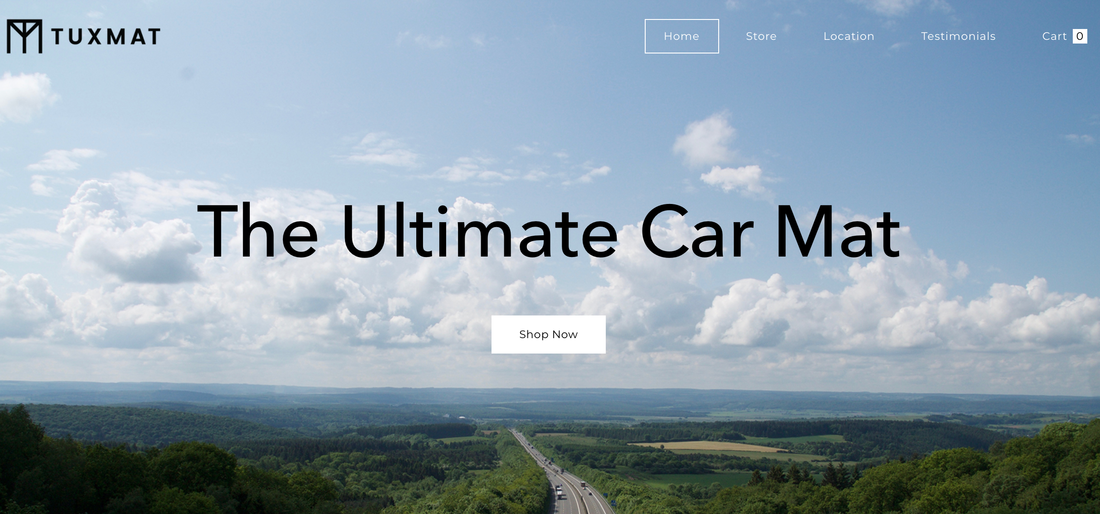
TUXMAT Clear Headlines
A powerful headline will bring users into the design and help them engage with the content (and product selection). Most website visitors will read the headline, even if they don't read any other copy on your website, so you have to make it count.
- Keep headlines short, clear and with a direct message.
- Tell users why your product or content is different than other available options.
- Show off your value proposition and test messaging that highlights your
products, features or service. (Use data, such as Google Analytics, so see what types of headlines get the most clicks.) - Keep the headline simple and use common language.
- Don't use vague statements or make users guess what you are trying to say.
- Just highlight one or two key features. Don't go overboard and try to list everything at once.
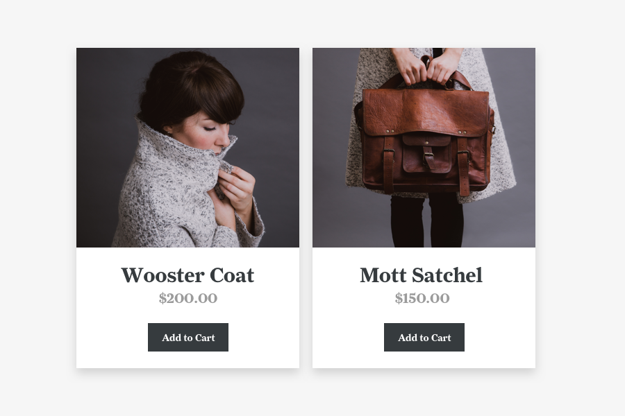
Use Compelling Imagery
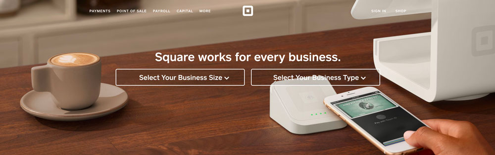
Square Up Imagery
Did you know that 90 percent of information transmitted to the brain is visual? It's true, according to the Tree Frog Agency. Compelling images and video are key to getting your message to users.
Compelling imagery has a few key characteristics:
Compelling imagery has a few key characteristics:
- It is sharp and high resolution.
- It creates desire, making users want to be part of the scene featured and interact with your product.
- It is consistent throughout the website to create a visual identity that users connect with. This includes photo crops and treatments, such as color overlays or use of still images versus video.
- It is used with simple backgrounds – or no real background at all – to showcase product details. You don't want a busy background to distract from the user goal of learning more about an item.
- It avoids photo filters and Instagram styling on product shots. You want images to feel real and authentic so users know exactly what they are getting.
Conclusion
Now grab a pen and paper and start jotting down some ideas to make your website shine. Start with a stellar first impression, create navigation that's simple and easy to understand, write headlines that show value and use strong images to sell products.
Even if you don't have a design background, almost anyone can create a great website using these pro tips. Just pick a template and put your design plan in action.
Even if you don't have a design background, almost anyone can create a great website using these pro tips. Just pick a template and put your design plan in action.
 RSS Feed