“Your logo here.” How many of us really think about that sentence? Adding your logo on any paper, document, any webpage or piece of content, instantly identifies you. Your logo is like an endorsement, a fingerprint, a portrait. It says, “This came from us. This is who we are. This belongs to us.”
Yet when it comes to our logo, unless we’re in the process of rebranding, most of us simply “set it and forget it.”
Most logos are designed in a flurry when companies are first starting up. Then, maybe once every few years, due to a change in the name, a change in management or a desire to “rebrand”, the company explores a variation on the theme. Once you have your initial logo, chances are it’s going to be part of your company in some form for a long time. Be sure it’s saying what you want it to say right off the bat.
There are many graphic designers out there who will happily create a logo for you in a matter of minutes. In fact—there are even automatic logo generators where you simply insert your company name and industry and press go—you don’t even need to talk to a human being. But what does an ad hoc logo really say about your company? Does it convey that you care and put thought and effort into your work, or does it say, “I do things quickly just to get them crossed off the list”?
So what is really in a logo? Does it matter all that much? With limited budgets and time, is it worth it to focus on your logo, or do you simply pick a font and color you like and go? Won’t your brand do the rest for you?
Well, yes and no. Your brand is who you are. It’s your company and corporate identity. Your brand is your story. Your logo, however, is your face. It’s your identity. It can be simple and straightforward, but it should be well thought out and careful. It should be thoroughly vetted to ensure it’s clear, and that it doesn’t accidentally say something you don’t want it to, or worse, accidentally come off as offensive!
Your logo can say quite a bit about you. It can tell customers if you’re loyal, modern, hip, earthy, playful or fun. It can give your brand personality. You probably personalize most elements of your organization from your website to your letterhead with your logo.
All the elements of your logo come into play when it comes to customer perception. Shape, color, font and design each convey a message. 80% of customers say color increases a brand’s recognition—after all, when you see yellow and red, don’t you think “McDonalds”? Look at NFL logos—from Green and Gold to Black and Silver, color plays a powerful role in our identification, learning and comprehension. These signature colors will carry throughout all of your branding, from your website to your company t-shirts.
To put your best face forward to your customers, make sure your logo is saying the right things about your brand, capturing who you truly are. Since 85% of consumers report that color influences purchasing decisions, your logo is a vital part of your branding.
What is your logo saying?
1. “I’m Fun!”
Simple fonts, bright colors and cute features can be appropriate for your logo if you work for a casual or creative industry. Colors like red, yellow, and orange convey brightness and playfulness.
Using simple fonts and symbols can also make your logo seem professional, but fun and casual. Sans serif font comes across as less formal and more hip than traditional serif fonts. Elements that appear hand-drawn, more flowing, and less stiff can keep customers in on the party.
2. “I’m Trustworthy”
Believe it or not, customers notice and read into the subtle nuances of your logo. Formal, symmetrical symbols, circles, crests and other classic designs denote a professional, trustworthy appearance.
Colors like black, navy, gold, and blue convey trust. Medical and financial companies often lean toward this more formal, stoic and solid look. Using classic, bold fonts and highlighting the first letter of your logo can also create a sense of solidarity.
3. “I’m Hip and Earthy”
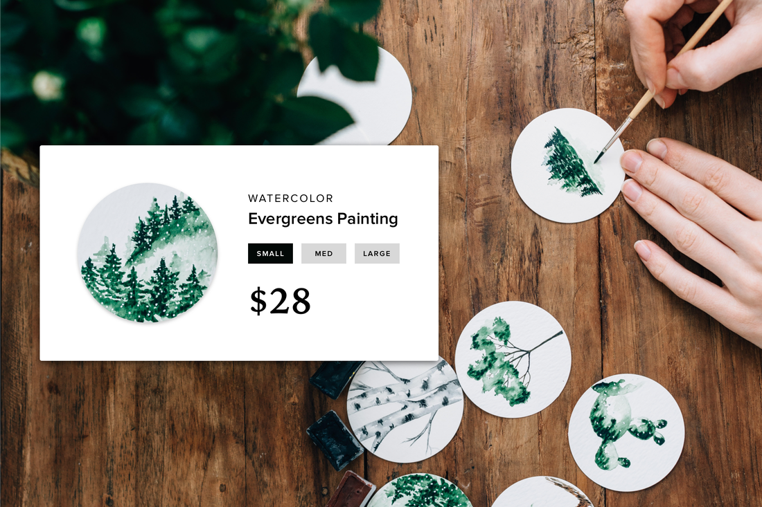
Greens convey modern, earthy vibes. Minimal designs and natural elements such as leaves, trees and globes make customers think of being outdoors, appreciating nature, and give you a hip, modern and earthy feel.
Designs elements inspired by nature—water, trees and leaves make you seem relatable and literally down to earth to your customer base. These green elements make us think of caring, fresh, organic, and healthy.
When it comes to logos, the personality and persona is the first and most important element. What the logo says, the symbolism involved, and the subtle message it conveys to your customers. Color is also a key element in getting your logo recognized and remembered for years to come.
Use consistency, creativity and put thought into your logo. Ask for second (and third, and forth) opinions before you find something you’re ready to go with. Once you have your logo, use it on your marketing materials, social media, websites and anywhere else your brand is discussed. Make it your signature and your identity. Put your logo here, there and everywhere!
 Megan Totka Megan is the Chief Editor for ChamberofCommerce.com, which helps small businesses grow on the web.


