In my first article for the Inspiration Center, we discussed some of the important basics for taking good photographs. Now let’s take a look at a few elements specific to composition that can really make your website images stand out from the crowd.
Rule of Thirds, Golden Ratio
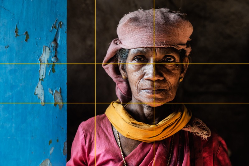
In the rule of thirds, photos are divided into thirds with two imaginary lines vertically and two lines horizontally making three columns, three rows, and nine sections in the images. Important compositional elements and leading lines are placed on or near the imaginary lines and where the lines intersect. The Golden Ratio (as shown in the image above), also known as the Golden Mean, Phi, or Divine Proportion was made famous by Leonardo Fibonacci around 1200 AD. He noticed that there was an absolute ratio that appears often throughout nature, a sort of design that is universally efficient in living things and pleasing to the human eye.
It is important to remember that these "rules" are more like guidelines, and the more experienced you become in photography you will find that these "rules" will become second nature. Break the rules when it feels right.
It is important to remember that these "rules" are more like guidelines, and the more experienced you become in photography you will find that these "rules" will become second nature. Break the rules when it feels right.
Orientation - Horizontal vs. Vertical
The first and most obvious rule of composition is in choosing a horizontal or vertical image. Horizontal images are perhaps the most common. It is natural to lift up the camera and hold it as it was made to be held. There are photographs that benefit with additional space on either side of the main object – city scenes, sweeping landscapes, and sports activity, for example. Yet there are also times when a picture is better staged vertically. The most obvious example of vertical staging is tall, thin objects like trees or buildings.
Patterns
There are patterns all around us if we only learn to see them. Emphasizing and highlighting these patterns can lead to striking shots – as can highlighting where patterns are broken.
Texture
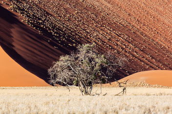
A photograph is two dimensional, but with the clever use of ‘texture’ it can come alive and become almost three dimensional. Texture particularly comes into play when light hits objects at varying angles. In the image on the left, the sun is grazing the dune from the left, revealing the texture in the sand and each of the bushes growing on the dune surface. The image on the right was taken at the same location with flat frontal light. The third image is photographed much later with the light coming from the right.
Frames
Framing is the technique of drawing attention to the subject of your image by blocking other parts of the image with something in the scene.
When photographing people and animals it is traditionally best to have them looking into the frame. But again, this is another "rule" where there can (and should) be exceptions. Sometimes you just have to go with your gut, such as with the image on the right where the woman is looking out of the frame. If there is movement in your picture, leave more space on the side of the frame to where the movements is heading. It looks more natural that way and lets the viewer have a feel for where the subject is going.
 Jeremy Woodhouse Jeremy's award winning photos have appeared in print all over the world. He started PixelChromePhotoTours.com with Weebly


