
Thinking like a designer can be hard, but it helps when building great websites. Your content and messaging may be spotless, but without solid design your website will fall flat. These 3 design tips will help you think like a designer and develop skills necessary to build a better website.
1. Minimize Text
Make your text copy as efficient and succinct as possible. Whether you are selling a service, showcasing your art, or sharing your band’s music, do your best to convey your message with minimal wording.
According to a study done by eMarketer.com, the average American spends 23 hours on the internet per week (87% of that is dedicated to emailing and Facebook). Of the group surveyed, 62% said that they were looking for ways to reduce time on the internet. With those statistics in mind, your website visitors will not necessarily have the time or desire to read a novel on your home page. When it comes to conveying your messages, use the most concise text possible.
A few rules of thumb for text content on your site:
- Use bullet points (see what I did there?), but only use them when it makes sense. Example: List of product features or instructions.
- Follow hierarchy in typography. This means knowing where to appropriately use titles, bold text, block quotes and regular text. Tutsplus is a good resource for this.
- Search the web for free icons. Creative Market, for example, often gives icons away for free.
- Bonus Tip: My aunt Brenda is an amazing web and marketing strategist for a Fortune 500 company, and we were speaking earlier this week about copy. She advised: “A person is born with only so many commas and exclamation marks that they can use in their life… make sure you don’t use them all up and run out too early!”
2. Get Inspired
There are times when your creativity may seem to die off and descend into a dark abyss... but have no fear, there is a way out! There are two resources that I regularly use for creative inspiration when it comes to websites: Pinterest and Behance.
There are times when your creativity may seem to die off and descend into a dark abyss... but have no fear, there is a way out! There are two resources that I regularly use for creative inspiration when it comes to websites: Pinterest and Behance.

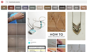
Sign up for a Pinterest account and "start pinning" today. This tool gives you a platform to gather all the awesome images and ideas from all over the web, and pin it all on your board. I do this for logo design, prints, and, of course, websites. When creating new sites for clients, I make sure to refer back to and explore my website pin boards. This helps me if I hit a mental block designing their site. Not only is it a great design resource, but it's also very relaxing and therapeutic to "pin" items!
|
Béhance.net is a network for designers, animators, and web developers alike. Some of the world's most renown designers showcase their chops and post their work regularly. Béhance allows you to follow certain artists, pros and amateurs, and also post up your work for the world to see. There are endless beautiful UI designs and website layouts to get inspiration from. I've started an account with just a couple projects, and it's fun to see what others think about my work and who appreciates it.
|
3. Use Smart Layouts
Make sure to take into consideration the size, style, and color of text. Consistency is king.
Try to create a set of rules for the look of your website and don't break them. If you have any inconsistencies with either the colors or font styles, then your website begins looking like a 3-ring circus...
...See what I mean?
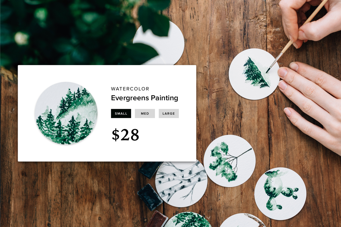
You’ll also want to be sure that the images placed within your website don't clash with each other in size and layout. For example:
Make sure to take into consideration the size, style, and color of text. Consistency is king.
Try to create a set of rules for the look of your website and don't break them. If you have any inconsistencies with either the colors or font styles, then your website begins looking like a 3-ring circus...
...See what I mean?
You’ll also want to be sure that the images placed within your website don't clash with each other in size and layout. For example:
Bonus Tip: Kuler is Cooler
Keep in mind that it’s key to balance the colors in your website. If you need help with general color schemes, Adobe offers a free tool called Kuler. Kuler allows you to check out the great color schemes that users have submitted, as well as sort by popularity and frequent use to see what has been trending lately. There is also an option to upload a picture and allow Kuler to automatically generate a beautiful color scheme from the pixels of the picture you’ve chosen! In short, be sure to integrate pictures on your website that blend well with your color scheme.
 Josh Barton Josh is a freelance designer specializing in logos, print and web development. Josh started BayAreaGraphicDesigner.com with Weebly