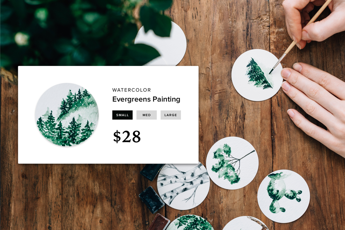
Your website consists of a collection of pages, like your homepage, general information pages, and product pages which are also known as landing pages. In fact, any page on your website where you encourage your visitors to make a purchase can be considered a landing page.
Specifically in this post, we will take a closer look at what are the latest trends in design and online marketing that can be used to optimize your landing pages for better conversion rates.
While the product itself plays a big role in whether users are interested in a purchase, it’s also the design you use that’s going to play a significant part in how users interpret your product, and whether they find it appropriate for their needs.
While the product itself plays a big role in whether users are interested in a purchase, it’s also the design you use that’s going to play a significant part in how users interpret your product, and whether they find it appropriate for their needs.
Identifying your landing page
Business owners have two choices:
The key component is to make sure that whichever you choose, the main focus should be solely on the product that you are selling. Having too many products or their features listed on one page can create confusion, and visitors naturally will want to steer away from those pages.
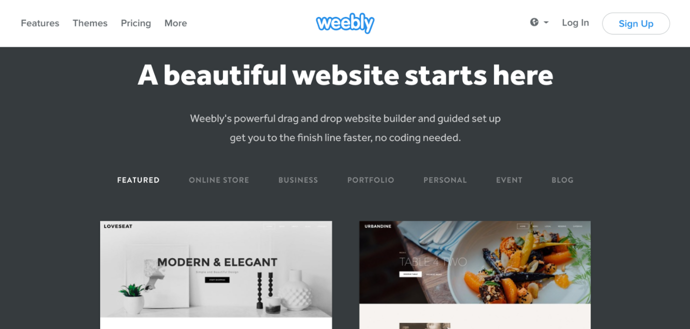
- Make their homepage their primary landing page; we can all take example from Weebly in this scenario.
- Create a separate page for the main product that you are selling, and use that as your primary page where you’re going to foster conversions.
The key component is to make sure that whichever you choose, the main focus should be solely on the product that you are selling. Having too many products or their features listed on one page can create confusion, and visitors naturally will want to steer away from those pages.
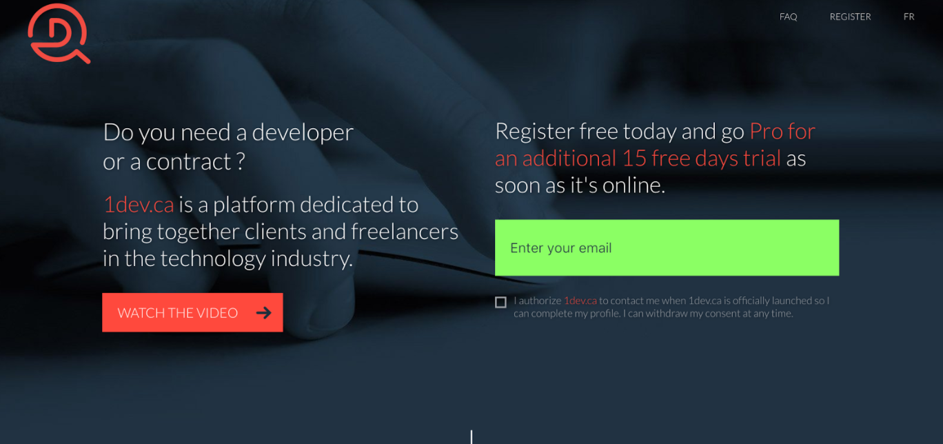
As you can see in the above example, this particular landing page focuses on providing services -- connecting clients with freelancers -- and the main intro of the page covers several important aspects of successful and converting landing pages:
The header part of this landing page has done already so much to identify itself, to provide easy to understand product description, and to enable for users to signup for news and announcements; which is also part of the email marketing campaigns that later can turn into leads and customers.
Let’s go through some of these points individually, and build upon them with more exciting and relevant insights on how to encourage conversions using thoughtful landing page design.
- Strong headline that indicates the purpose of the service.
- A link to a video presentation of how the product works.
- Clear subscription form box to onboard customers right away.
The header part of this landing page has done already so much to identify itself, to provide easy to understand product description, and to enable for users to signup for news and announcements; which is also part of the email marketing campaigns that later can turn into leads and customers.
Let’s go through some of these points individually, and build upon them with more exciting and relevant insights on how to encourage conversions using thoughtful landing page design.
#1: Crafting a clear product headline
Your product headline should clearly and effectively explain what your product does, and what it can do for the customer.
What are some examples of good product headlines?
What these companies are doing in this case are, they use clear and concise explanations of what their product, and its business model, is and how you can use it to enhance your own business experience.
What are some examples of good product headlines?
- Donorbox -- “Attract more recurring donors. Get a fast, optimized donation payment system in minutes.”
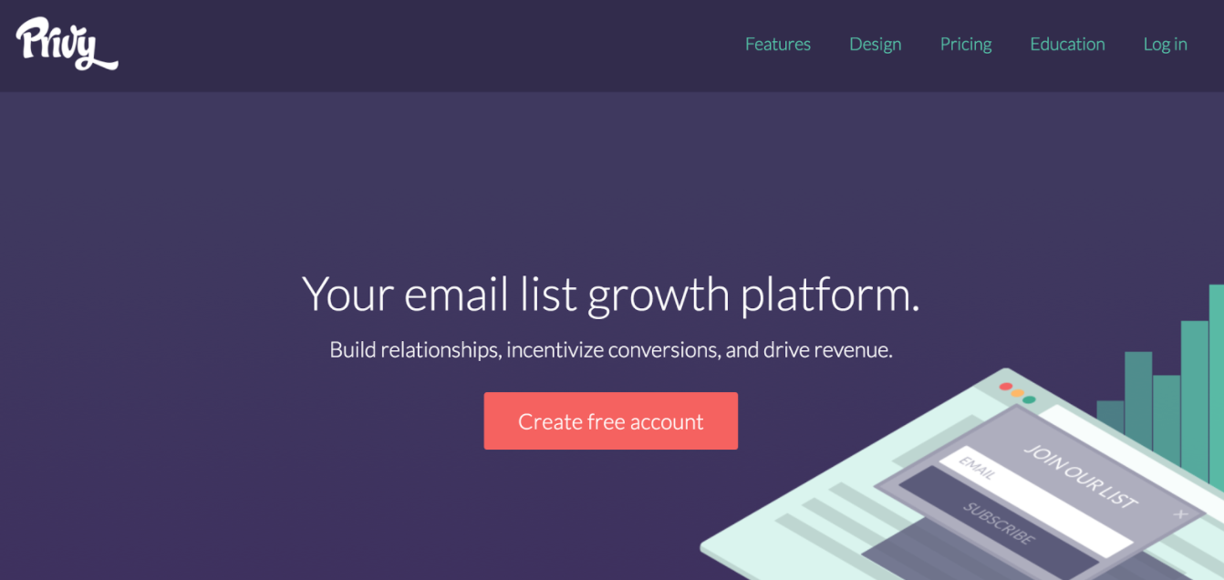
- Privy -- “Your email list growth platform. Build relationships, incentivize conversions, and drive revenue.”
What these companies are doing in this case are, they use clear and concise explanations of what their product, and its business model, is and how you can use it to enhance your own business experience.
The homepage of Privy is clear and concise, with the emphasis on a direct headline complimented by an effective Call-to-Action button for visitors to create a free account, this in itself generates a lead, and based on the free trial account experience, potential customers can then decide on whether they feel that the product lives up to its standards.
You might, for example, be a manager of a Yoga Studio; in that case, use your available header space of your landing page to create a lasting impression of the kind of services you can provide.
Do you specialize in Yoga for the Disabled, or Hot Yoga for fitness geeks?
Being clear, constructive and on-point about your services or product abilities will allow customers to better understand everything else on your landing page, like product description and use cases.
Do you specialize in Yoga for the Disabled, or Hot Yoga for fitness geeks?
Being clear, constructive and on-point about your services or product abilities will allow customers to better understand everything else on your landing page, like product description and use cases.
#2: Using visuals to illustrate purpose
“The brain processes images 60,000 times faster than it does text. And it’s more accustomed to processing images—ninety percent of the information sent to the brain is visual, and 93% of all human communication is visual.”
The steady growth of web technology has enabled for website developers to use far-reaching features and tools for creating web pages that are visually appealing and easy to interpret.
While anyone can add visuals to their landing pages, it’s the intent and context that matters the most. How are you using visuals on your landing pages right now to encourage action?
You don’t have to look far to yield inspiration for ways to use visual elements on your landing pages, Weebly homepage integrates several of such elements.
This particular element of the landing page shows potential customers the different themes that Weebly provides, but does so in a very unique and interactive way, whilst promoting visual imagery to compliment the theme choices.
Three things to take-away:
And although this element doesn’t showcase ALL themes, it gives potential customers a significant taste of what to expect, which is something you can implement in your own landing page designs.
You can always expand your understanding of how other online businesses design their landing pages using visual elements by visiting design inspiration lists, or browsing archives of online companies on any popular startup archive website.
Three things to take-away:
- The subsection provides a concise description of how Weebly themes work.
- Users can navigate from a selection of theme categories within the same window.
- Themes are accompanied by visual examples, which can be clicked-on to learn more and/or activate.
And although this element doesn’t showcase ALL themes, it gives potential customers a significant taste of what to expect, which is something you can implement in your own landing page designs.
You can always expand your understanding of how other online businesses design their landing pages using visual elements by visiting design inspiration lists, or browsing archives of online companies on any popular startup archive website.
#3: Build for optimal performance
Site speed affects multiple areas of your business; bounce rates, conversion rates, and organic search traffic.
Whether it’s one-time scripts, or too adventurous use of visual content, it pays to inspect your landing pages for optimal speed, and optimize wherever possible.
Whether it’s one-time scripts, or too adventurous use of visual content, it pays to inspect your landing pages for optimal speed, and optimize wherever possible.
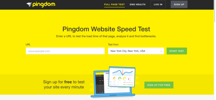
Pingdom is one amongst many online tools for doing conclusive scan on your website performance, and it also gives you a detailed rundown of what you can do to improve site/page speed according to latest standards.
What should you look out for when building for page speed?
And if you are not yet convinced, research done by KISSMetrics showed that a 1 second delay in page response can result in a 7% reduction in conversions.
So, site speed matters, and it can affect your conversion rates greatly, if you optimized for speed, or send them down the drain if you forget to optimized even for the most basic of web performance standards.
What should you look out for when building for page speed?
- Requests -- minimize your internal and external requests per page to a bare minimum. This means narrowing down the essential resources you need to load in order for the landing page to render fully.
- Compression -- ensure that your visual content -- images in particular -- are compressed fully, while JavaScript and CSS files should be minified to reduce junk data.
- Browser Cache -- caching helps the browser to store information that's frequently accessed (like your website logo), so enabling caching can help to speed up the site performance by not making visitors to load each resource every time they visit your pages.
And if you are not yet convinced, research done by KISSMetrics showed that a 1 second delay in page response can result in a 7% reduction in conversions.
So, site speed matters, and it can affect your conversion rates greatly, if you optimized for speed, or send them down the drain if you forget to optimized even for the most basic of web performance standards.
#4: A/B test different versions of your landing page
It’s highly unlikely that anyone could ever craft the perfect landing page for their product from a single attempt, in fact, that’s a very shallow approach to making the most of your landing pages, and even understanding the way that your visitors are interpreting your design.
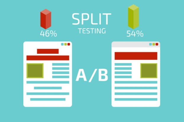
A/B testing (the process of checking different variations of a page) can yield business owners invaluable insight about what works and what doesn’t, allowing for a smoother decision making process that’s based on actual data coming from your own analytics.
A/B testing (the process of checking different variations of a page) can yield business owners invaluable insight about what works and what doesn’t, allowing for a smoother decision making process that’s based on actual data coming from your own analytics.
Before you start checking the conversion performance of alternate versions of your original landing page, ensure that your existing one has been up for long enough to give you extensive and detailed information about the performance of each of the pages elements, and only then work on testing out new alterations so that you can compare the performance of both based on actual valid data.
What are the most common elements that professional business owners A/B test on their landing pages?
Once you have decided on your final design, you can customize the above said elements and try their performance over time.
You’re bound to come across a setup that will yield significantly better conversion rates than anything else you have tried, and that’s your gold ticket for increasing sales without investing any money into the process, well, perhaps a little bit of your time and thinking, but that’s about it.
What are the most common elements that professional business owners A/B test on their landing pages?
- Calls-to Action Buttons: Their text, shape, and color.
- Headlines: Different lengths, fonts, and messages.
- Images: Testing digital vs. real art, experimenting with context.
- Forms: Trying out different form length and style.
- Social Proof: Adding reviews, testimonials, client logo’s, etc,.
Once you have decided on your final design, you can customize the above said elements and try their performance over time.
You’re bound to come across a setup that will yield significantly better conversion rates than anything else you have tried, and that’s your gold ticket for increasing sales without investing any money into the process, well, perhaps a little bit of your time and thinking, but that’s about it.
 Alex IvanovsAlex Ivanovs is a digital marketing entrepreneur, he writes about business, but also healthy living. Learn more on SkillCode.


