Did you know that links are more effective when they use more (but not too many) words? Did you know that buttons become more usable when they contain certain kinds of word combinations?
It might seem simple to whip up a link or a button, but it isn't so easy to make them do their job of getting people to sign up, visit more pages or buy your product. In fact, the way you word these crucial design elements could be impacting your business.
Links: It's All About “Scent"
Way back in 2007, respected design researcher Jared Spool started talking about the idea of “designing for scent" (here's the definitive document on the subject). This refers to crafting links and buttons in a way that optimizes a user's ability to “pick up the scent." Basically, every clicked link should help users feel like they are getting closer to the information or result that they want.
After extensive research, Spool and his team came to a few conclusions:
Longer text links instill more confidence than shorter text links: This is true because links with more words in them — generally 7–12 words, in fact — give users a more specific idea of where the link goes and what will happen after clicking it. Example: "Read our summary of the article in the Research section" vs “Read the article here." In the longer example here, you find out that a website has posted a summary of an article, that it appears in the website's own Research section and that you will not be leaving the website to go to another article. Three questions answered in one link.
"Scent" is also helped by mapping the words in the link to the words the user already has in mind: These are called “trigger words." A person who comes to a website to shop for a couch will look all over the site for the word “couch." Even if the user is searching for a very specific product and happens to know its official model name — say, the “MJX26" — the proper model name is not a great link all by itself; it contains too little information for all those people who don't know the model name, and it fails to indicate what you'll see after clicking it. Will it be a product sales page? A Help document? When writing your link, consider which words the user will be thinking about, and try to include some version of those in the link. (And then make sure that the information you promise in the link actually shows up on the next page).
Buttons: It's All About Action
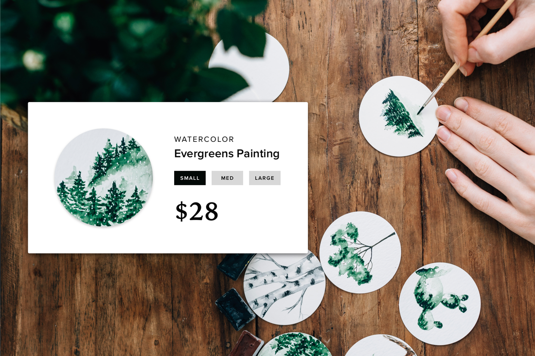
Buttons, on the other hand, usually contain fewer words. Very few. They also tend to be used for important tasks, like registering or saving a file. Buttons have to do a lot more with a lot less.
The goal isn't to use more words. It's to use stronger words. There are three types of word combinations that work most consistently and perform the best in the most situations.
Buttons are all about action. They tell the user what to do — Sign Up, Download or Choose an Image. You don't have to write a paragraph of instructions; an effective button says it all.
Aim to create a “scent of information," and your users will get more out of your site every time they use it.
Links: It's All About “Scent"
Way back in 2007, respected design researcher Jared Spool started talking about the idea of “designing for scent" (here's the definitive document on the subject). This refers to crafting links and buttons in a way that optimizes a user's ability to “pick up the scent." Basically, every clicked link should help users feel like they are getting closer to the information or result that they want.
After extensive research, Spool and his team came to a few conclusions:
Longer text links instill more confidence than shorter text links: This is true because links with more words in them — generally 7–12 words, in fact — give users a more specific idea of where the link goes and what will happen after clicking it. Example: "Read our summary of the article in the Research section" vs “Read the article here." In the longer example here, you find out that a website has posted a summary of an article, that it appears in the website's own Research section and that you will not be leaving the website to go to another article. Three questions answered in one link.
"Scent" is also helped by mapping the words in the link to the words the user already has in mind: These are called “trigger words." A person who comes to a website to shop for a couch will look all over the site for the word “couch." Even if the user is searching for a very specific product and happens to know its official model name — say, the “MJX26" — the proper model name is not a great link all by itself; it contains too little information for all those people who don't know the model name, and it fails to indicate what you'll see after clicking it. Will it be a product sales page? A Help document? When writing your link, consider which words the user will be thinking about, and try to include some version of those in the link. (And then make sure that the information you promise in the link actually shows up on the next page).
Buttons: It's All About Action
Buttons, on the other hand, usually contain fewer words. Very few. They also tend to be used for important tasks, like registering or saving a file. Buttons have to do a lot more with a lot less.
The goal isn't to use more words. It's to use stronger words. There are three types of word combinations that work most consistently and perform the best in the most situations.
- Verb-nouns pairs: these are combos like “Save Changes" and “Send Message," where the first word explains the action to take, and the second word explains the object the action affects. Your “changes" on a banking website, for example, might be an update to your mailing address or phone number. “Save" tells you exactly what's about to happen.
- Verb phrases: these are also multi-word combinations, but this time, the noun is substituted with something else. “Sign up now" creates a sense of urgency. “Send it!" creates a hint of personality through more natural language. Check out the effective the "Shop Now" phrase featured on the homepage of Java to Go.
- Verbs (all by themselves): “Download" is such a ubiquitous term for web users that it doesn't need a follow-up word. "Download the PDF" can offer more specificity when it's not otherwise clear what the user will be downloading, but if it is already clear, “Download" is good all on its own. Just make sure when you stick to a single word that the resulting action is painfully obvious.
Buttons are all about action. They tell the user what to do — Sign Up, Download or Choose an Image. You don't have to write a paragraph of instructions; an effective button says it all.
Aim to create a “scent of information," and your users will get more out of your site every time they use it.
 Robert Hoekman Jr Robert is a design strategist who has authored several renowned books and dozens of articles on User Experience. He is also a columnist and contributing editor at Iron & Air.


