

You have a killer product but just can't seem to get anyone to click the "buy now" button. Are you making a design mistake that's impacting sales?
Here are five common design mistakes on eCommerce websites (and ways to fix them).
1. Cluttered Product Pages
Too many options can fluster users, causing them to abandon shopping carts or shop elsewhere. Clutter comes in many different forms, from pages that have too many elements to individual products with too many options. Online shoppers may be quick to leave if they can't easily pick out an item or make a purchase.
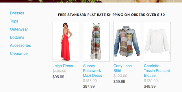
The fix: Streamline product pages with one or two images and a description using a grid-based layout. Havoc Clothing keeps items simple and easy to see using a grid-based format, plenty of white space between items and inviting product photography. From the main product listings to individual product pages, every item is clearly visible right away.
2. Too Much Text
Shoppers don't come to an e-commerce website to read a novel. Most are there to find a deal or make a purchase and move on. Too many sites are filled with long descriptions that can be overwhelming.
The fix: Design for the scroll. This might sound like an “old-school" philosophy, but online shoppers need to see an item, short description and options and purchase button immediately. Include this information on the “first screen" — above the scroll on desktop websites and on the first page for mobile or tablet devices. For all other details, push them lower on the page, giving your actual product more room to shine on the first screen.
3. Hidden Shopping Cart
Users should always be able to locate the shopping cart and checkout page. Go check your website right now. Is it visible at all times? If not, you could be losing valuable sales conversions. Think about how the shopping cart button looks as well. Are you using an icon or text?

The fix: Start with a common shopping cart visual for identification. There are plenty of cart icons out there; use something that resembles the standard cart design or the words “shopping cart" or “cart." Users know what these things are and it makes shopping easy.
Then, make sure it is visible at all times. Consider storing the shopping cart icon in the navigation (you might want to make it sticky so the cart follows users as they scroll). Think about the size of the cart as well. An oversized icon or button is a great way to help users get to the cart with ease. Remember, if a user can't find the cart, he or she can't make a purchase.
Dharma Yoga Wheel includes the shopping cart in “sticky" navigation that is always at the top of the page. With a common icon, item count and purchase total, it is easy to see what you are buying and finish the purchase from anywhere on the website.
4. No Mobile Shopping Option
You have a great product and a beautiful online storefront, but no option for mobile shoppers. What? More than 30 percent of your traffic is from mobile. Every online shop owner should be taking advantage of this valuable customer base with a mobile-optimized storefront and if you are not, you are likely missing out on sales.
The fix: Ensure you have a mobile shopping option by creating your website on a responsive framework. This one-site solution will ensure that your website -- and eCommerce features -- work seamlessly on every device, from desktops to tablets to mobile phones.
5. Unclear Buttons
Where is your call to action? It's a simple question, but too many eCommerce websites don't have a prominent “buy now" button. With every item, there should be an easy to see – and click – button to make a purchase. (And every page on your eCommerce website should include a purchase conversion.)
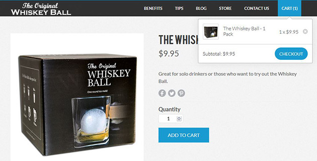
The fix: Don't be afraid to make buttons large. Include plenty of clear language as to what the button does, and use a bright color to make it stand out from other elements on the page. As an added bonus, let users know that the item actually went into the cart, and if you have a single-product site, redirect users to the checkout page.
The website for The Original Whiskey Ball has clear calls to action throughout the site. Every page has a bright blue button telling you what to do next, from the “Purchase One" button on the home page to the “Add to Cart" buttons for each item. The site goes the extra step as well — when a user adds an item to the cart, the cart activates a small dropdown menu with cart contents and a “Checkout" button (see image above).
The website for The Original Whiskey Ball has clear calls to action throughout the site. Every page has a bright blue button telling you what to do next, from the “Purchase One" button on the home page to the “Add to Cart" buttons for each item. The site goes the extra step as well — when a user adds an item to the cart, the cart activates a small dropdown menu with cart contents and a “Checkout" button (see image above).
 Carrie Cousins Carrie is a designer, writer and content marketer. She has more than 10 years of media and marketing experience.