Great websites draw you in and make you want to learn more. The best sites compel you to take action, either to make a purchase, share with your friends or maybe join a mailing list. We recently took a tour of Weebly sites to find 11 examples that meet this standard in a variety of creative ways.
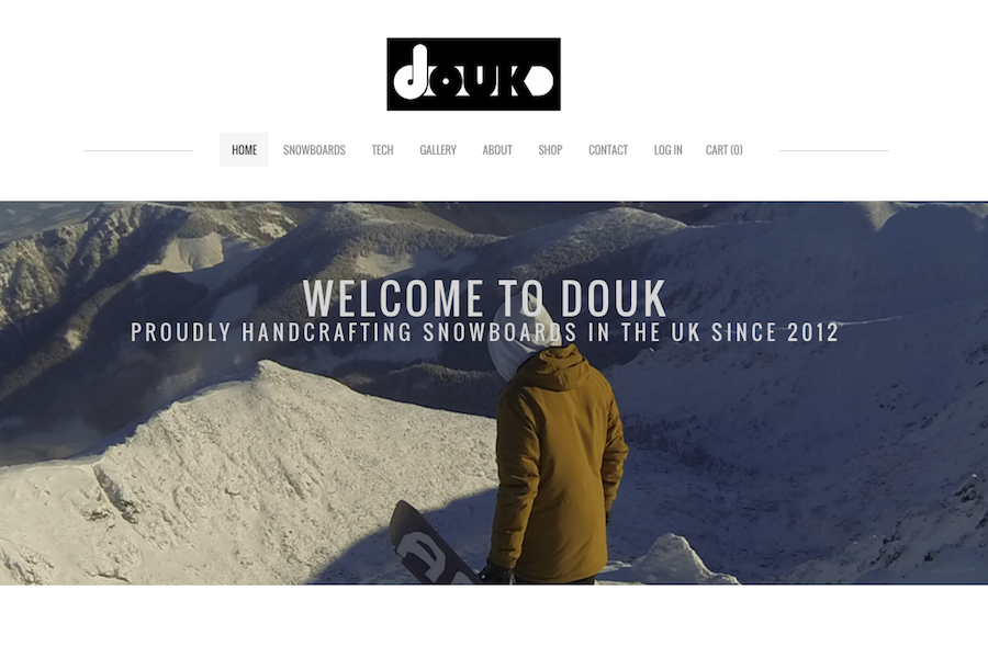
Example 1: Douk Snowboards
What it's about: An online store that takes would-be buyers deep into the process behind the UK company's production of signature, handcrafted snowboards.
What it's about: An online store that takes would-be buyers deep into the process behind the UK company's production of signature, handcrafted snowboards.
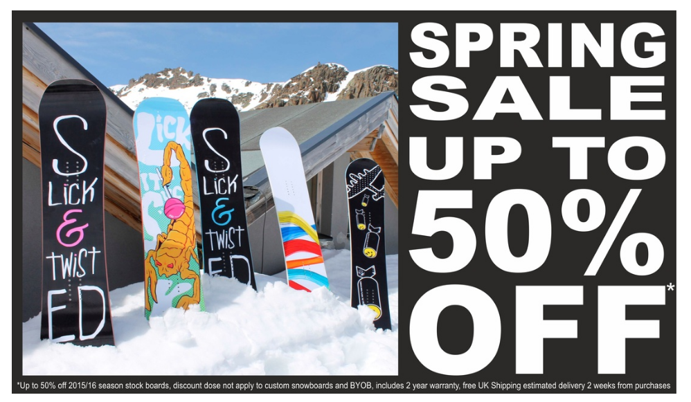
What makes it awesome: A slideshow highlights what makes the business unique and includes a coupon as a well-placed call to action for inspired visitors.
Example 2: Wall'in
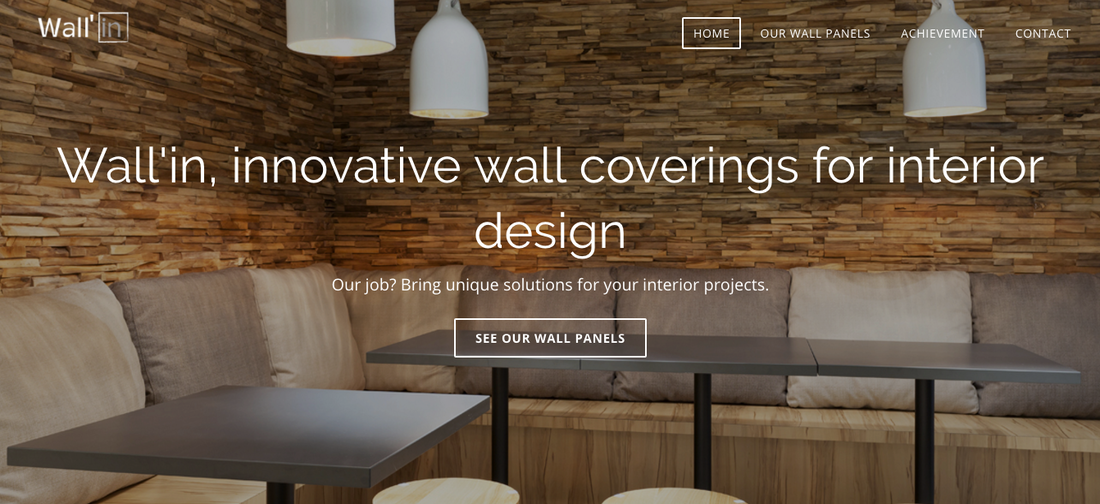
What it's about: An online brochure for the company's wall coverings that is available in both English and French.
Example 2: Wall'in
What it's about: An online brochure for the company's wall coverings that is available in both English and French.
What makes it awesome: Translation is done elegantly, handled as an opportunity to show different concepts. Clean design and bright photos across both sites demonstrate a high level of quality in the product.
Example 3: Kikoplastic
What it's about: Portfolio site for award-winning professional illustrator, Alberto Jaime Rodríguez Pérez.
Example 3: Kikoplastic
What it's about: Portfolio site for award-winning professional illustrator, Alberto Jaime Rodríguez Pérez.
What makes it awesome: Creative use of abbreviations and icons pull the reader in and make you want to learn more. Clean design with plenty of white space makes these devices all the more noticeable. Who wouldn't want to work with an artist who tracks his coffee consumption as relentlessly as his illustration projects?
Example 4: The Whiskey Ball
What it's about: A comprehensive online store for selling what the company calls the "original" ice ball mold for cocktails.
Example 4: The Whiskey Ball
What it's about: A comprehensive online store for selling what the company calls the "original" ice ball mold for cocktails.
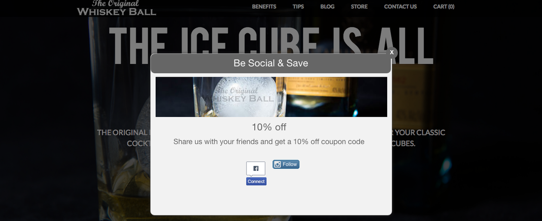
What makes it awesome: The pop-up coupon shown in the bottom right of the main page doesn't activate immediately. Instead, visitors are encouraged to look around -- and then claim 10 percent off if they're willing to share their interest on Facebook or follow along on Instagram.
Example 5: C My Paris
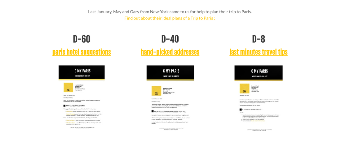
What it's about: A travel site that doubles as a store for the team that sells a local perspective to Paris visitors, guiding them as if they were part of an intimate tour.
Example 5: C My Paris
What it's about: A travel site that doubles as a store for the team that sells a local perspective to Paris visitors, guiding them as if they were part of an intimate tour.
What makes it awesome: Not only is it an interesting business idea, but the team's blog also gives away great ideas to demonstrate their expertise. A front page link to samples gives buyers a better sense of what they'd get for their money.
Example 6: The Bike Seat
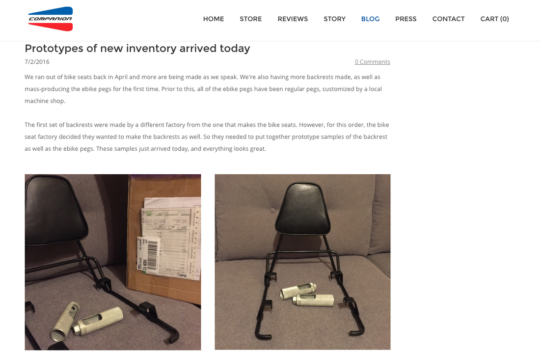
What it's about: An online store for the companion bike seat, which transforms any bike into a bicycle built for two.
Example 6: The Bike Seat
What it's about: An online store for the companion bike seat, which transforms any bike into a bicycle built for two.
What makes it awesome: Includes a special story section that gives personality to the business. An accompanying blog goes further by showing how the founders are working on and expanding the product line.
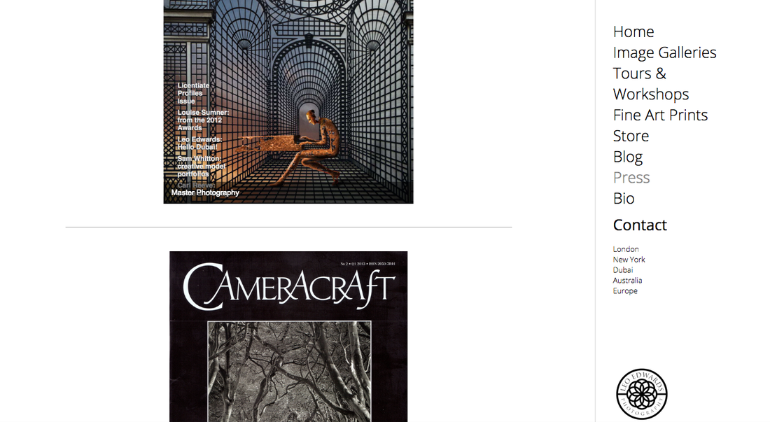
Example 7: Leo Edwards Photography
What it's about: A portfolio site that also sells tours for adventure photographer Leo Edwards.
Example 7: Leo Edwards Photography
What it's about: A portfolio site that also sells tours for adventure photographer Leo Edwards.
What makes it awesome: Creative use of embedded clips on the press page highlights Edwards' skill and expertise. An accompanying free, downloadable eBook gives prospects something of value in exchange for their contact information.
Example 8: Dwarmis
What it's about: Fashion industry veteran strikes out on her own to design unique backpacks and support local manufacturing.
Example 8: Dwarmis
What it's about: Fashion industry veteran strikes out on her own to design unique backpacks and support local manufacturing.
What makes it awesome: A beautiful homepage that features advanced visual eCommerce delivery. Dwarmis tells a story through a slide show of product shots with interesting backgrounds, followed by cascading imagery of designer bags in various settings. Wonderful use of minimalist design, product photography and shoppable content.
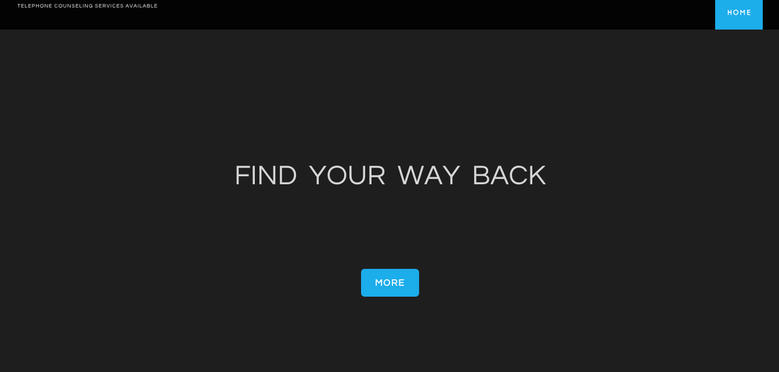
Example 9: Detailed Engagements
What it's about: Gives anxious couples a closer look at their wedding planning services, including a "lookbook" of prior work and a blog that explains what to expect.
Example 9: Detailed Engagements
What it's about: Gives anxious couples a closer look at their wedding planning services, including a "lookbook" of prior work and a blog that explains what to expect.
What makes it awesome: A simple main page leads to two potential experiences for visitors interested in learning more: a few samples for the curious, or contact details for those who wish to talk further.
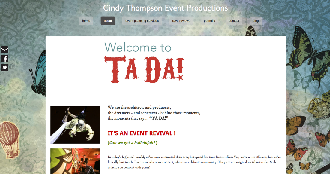
Example 10: Cindy Thompson Event Productions
What it's about: An online brochure that also hosts the portfolio of this Portland event planning firm, led by founder Cindy Thompson.
Example 10: Cindy Thompson Event Productions
What it's about: An online brochure that also hosts the portfolio of this Portland event planning firm, led by founder Cindy Thompson.
What makes it awesome: Creative use of a beautiful, circus-like design that holds together across the various navigational elements of the site while also highlighting the sales message of the team behind the site (i.e., hire us and you'll get a magical event worthy of the phrase "ta-da!").
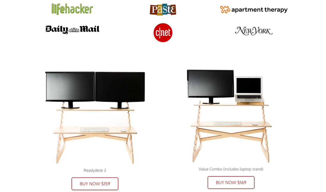
Example 11: The Readydesk
What it's about: A showcase and online store for the adjustable standing desk after which it's named.
Example 11: The Readydesk
What it's about: A showcase and online store for the adjustable standing desk after which it's named.
What makes it awesome: Multiple links to shop at different (but relevant!) points on the main page plus a right sidebar that stays hidden until clicked. Photos of the product in action combined with other visual devices, such as using logos to link to product reviews, pulls readers in without bludgeoning them with a sales message.
Ready to get started? Lets go.
Ready to get started? Lets go.
 Tim Beyers Tim is a freelance business writer. He writes about the business of innovation, comics and genre entertainment on The Full Bleed.

