Nobody wants a website that feels old or dated, but a complete overhaul may not be in the plan either. Luckily, there is a middle ground — here are a few web design trends for 2015 that you can use right now to give your website, blog or online store a refreshing new look.
1. Ditch Traditional Navigation and Go "Hamburger"
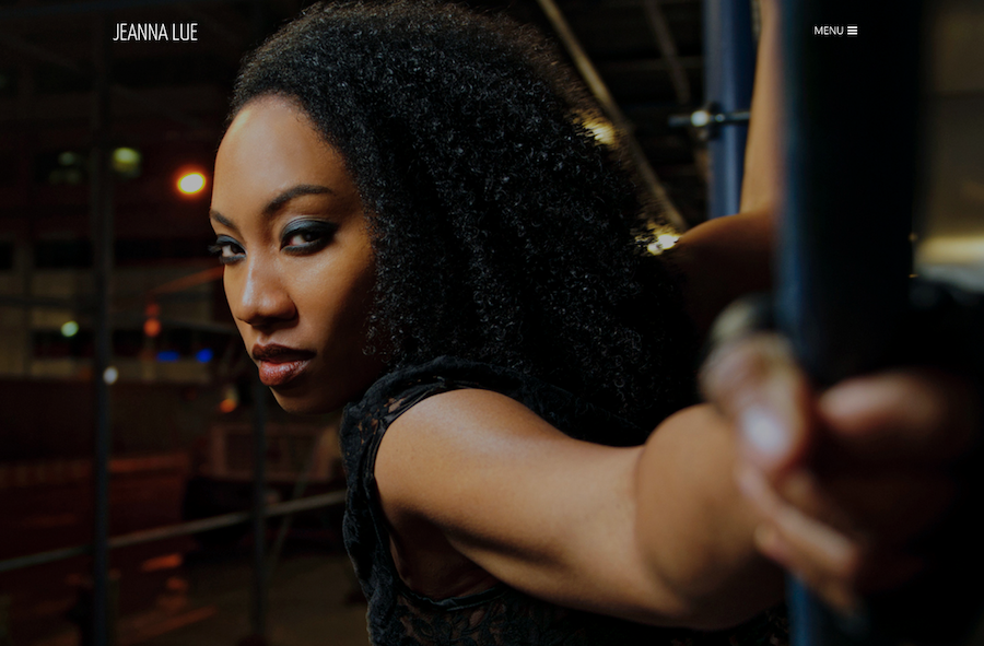
An expandable “hamburger" menu is a popular new trend for modern website navigation. The stacked three-line icon looks great on desktop and mobile with one-click for full navigation expansion with some nice basic animation.
Jeannalue.com uses the hamburger icon to highlight a beautifully executed homepage. Designers like this technique because of its simplicity and integration with a number of different design styles. The trend is easy to apply because it doesn’t require a full-scale redesign.
Hamburger icons work wonders as a visual cue (the icon mimics a menu list), as well as saving valuable screen space and providing compatibility with numerous background styles. The navigation icon can be placed on the left or right side of the screen and compliments other design trends like flat website frameworks or responsive design.
Get started: Hamburger menus are already featured on several Weebly themes including Redux, Superset and Venue.
2. Make Text and Images Bigger
Big visuals have a big impact. This applies to both text and images, which can be combined to create a homepage that leaves a strong impression. Supersized image and text design is commonly referred to as a “hero header” and can be used for landing pages or to create dramatic interior layouts.
A hero header is often a full-screen style image with a short amount of overlay text. This dynamic visual trend is popular because of its simplicity and minimal content requirements. One or two great images and a single block of text is usually enough to create this effect.
When trying this web trend for yourself, pair a full-screen image with a strong, concise call to action. Consider a simple typeface at a size of 85 points or more, and keep the message simple (think two to three words). Here’s an example of simple, powerful imagery with the Bradley theme.
Get started: Try a landing or splash page layout for your site and then experiment with a few different text styles. Changing the size of text is easy from the site builder in Design > Change Fonts.
3. Add Hints of Bold Color
Bold and vibrant colors first became popular with the rise of flat design, and continue to represent an important aspect of modern web design. Bold color usually means any hue that includes deep saturation and is typically without a tint or tone.
You can use the technique without changing your entire website’s color palette. Simply add a touch of bold color to important icons, buttons or elements. Unfold Yoga & Wellness uses bold color in navigation and buttons to drive visitor attention to the right places.
Get started: The Flat UI Color Picker is a great tool that includes a mix of interesting color choices for inspiration. You can change predefined theme color palettes in the theme library or use the code editor for full customization.
4. Streamline Content into a Single Column
Forget those extraneous sidebars and streamline your content with single column design. This trend allows you to tell stories without distractions.
Single column design is best for websites with deep content that want to focus on immersion and storytelling. Pair single column content with parallax scrolling effects for maximum impact.
Get started: Highlighter is the perfect theme to experiment with this web design trend. If you have a blog, you can turn off the sidebar from Settings > Blog to experiment with this minimalist style framework.
5. Add a Ghost Button
Ghost buttons are clickable buttons that lack the solid layers of traditional buttons. The button itself is typically transparent with a strong border outline. Ghost Button’s are one of the most popular web trends in 2015 and is relatively easy to implement.
Daniel Rosenthal Photography uses ghost buttons in the navigation for a natural and unobtrusive addition to the overall site design. Designers love this trend because ghost buttons provide subtle augmentation to design elements around them. They sit naturally on top of a photo or colored background and represent a simple, yet elegant contribution to the website.
Get started: Switch to a theme that uses ghost buttons. Here’s an example of homepage ghost button with the Venue theme.
What design trends have you seen this year that you would like for your website? Let us know in the comments!
 RSS Feed