When we first asked you to reimagine your site for our Before & After Contest we had no idea how many amazing entries were were about to receive. From photographers and actors to restaurant owners and writers, we were blown away by the quality and diversity of site redesigns that you shared with us.
We want to thank everyone who entered the contest and took the time to update their website, store or blog. The quality of your work was so good that we couldn’t pick just one winner, in fact, we saved many of our favorite entries and plan to spotlight them in the future.
So, without further ado, lets take a look at our two big winners!
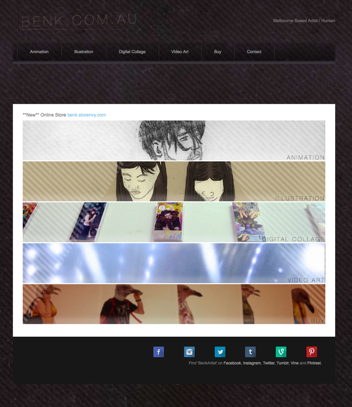
Benk.com.au
Before
Before
After
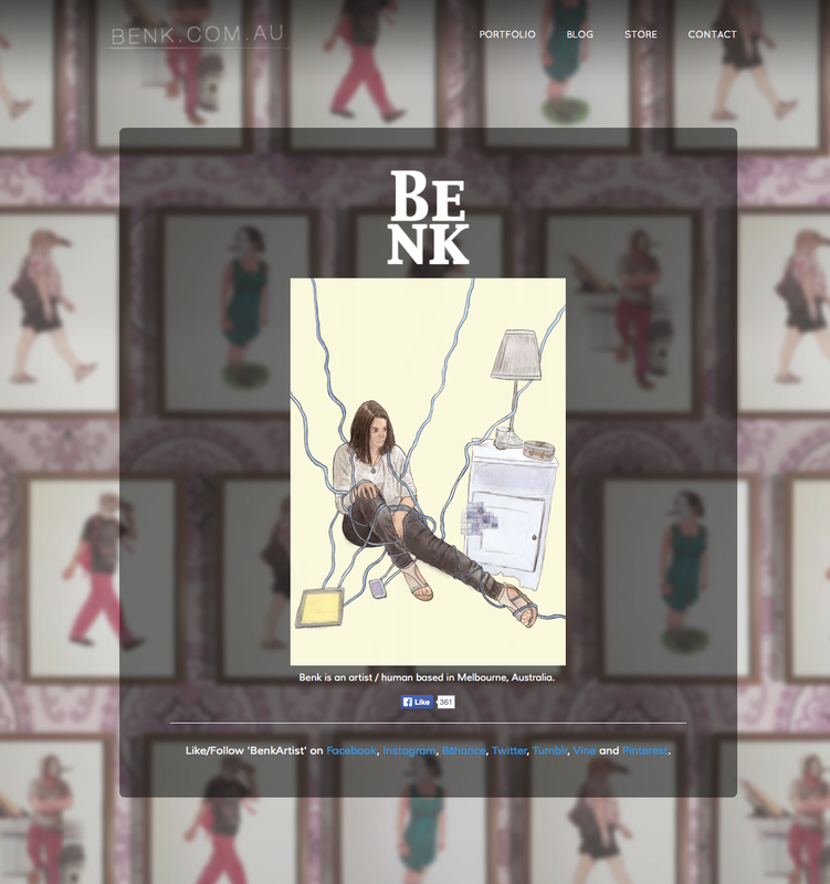
Benk is a Melbourne-based artist, illustrator and animator. He used a customized version of Birdseye along with the background editor to create a new, visually striking homepage with a greater focus on his artwork. He also used a simplified top navigation design to make it easier for visitors to consume his content on internal pages.
Benk uses a Facebook like button to facilitate social sharing directly from his homepage. This new “How’d They Do That” video walks through the implementation of this feature, which you can apply to the social media website of your choice:
Benk uses his website as a hub for his online presence. He says, “Having my website well coded, good looking and up to date definitely makes a positive impression on clients or anyone who wants to see what I do.”
Previous versions of Benk's website, though well made, felt either like a nightmare to update or too bland. He eventually found the right mix of good design and easy-to-edit content, saying, “I’ve found a good balance. A visually impressive site that’s easy to change around as I need.”
Benk also has some advice for other creative people looking to start their something, “Not everything you do will have monetary gain, but if you keep working hard and getting stuff out there, opportunities will begin to come back to you. Making your website as concise, clear and easy to navigate as possible also helps.”
His advice to fellow entrepreneurs? "The main thing is to keep working at your passion."
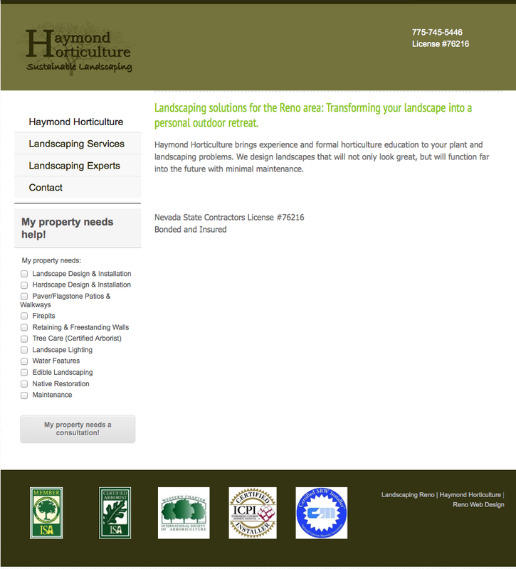
Haymond Horticulture
Before
After
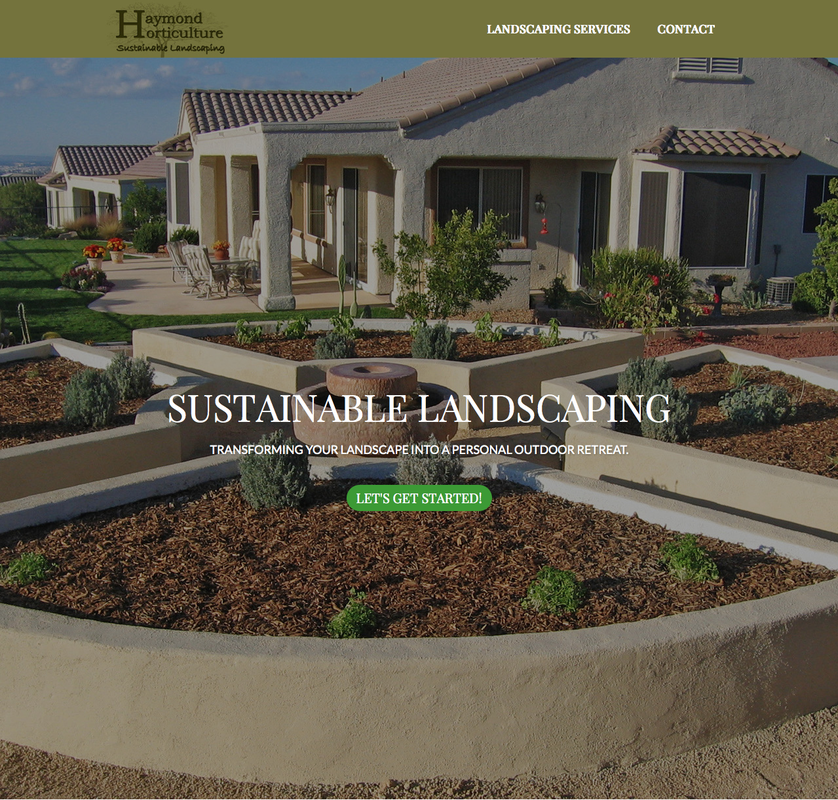
Web Designer Angela Refsland utilized an image-heavy homepage and clear call to action button to spice up the Haymond Horticulture website. Angela focused on a visual style that highlighted the company’s landscaping projects, letting the company’s work speak for itself with enticing visual elements in support.
Angela used a relatively advanced tactic to create anchors for image links on an internal page. This strategy makes it easy for visitors to navigate around pages with lots of information. The following “How’d They Do That” video details exactly how the effect was achieved:
Agnela has been building websites since she was in 6th grade, eventually starting her own web design business based out of her home in Reno, Nevada.
As an experienced designer, Angela recommends several key strategies for every website, “Visuals: use custom graphics, use photos worth paying for, but keep it understated and simple. Words: the fewer the better, be original, be clear, revise and change regularly.”
Her advice for people looking to create their own website? “Your website needs to come from that place inside you that wakes you up in the morning, excited to start another day.”
A big congratulations to our Before & After winners! Let us know what you think about these winning sites and stay tuned for details on more of our favorite entries.
 RSS Feed