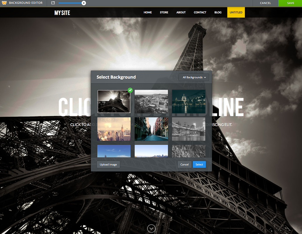
For the first video we take you step-by-step through the creation of The Whiskey Ball homepage. Enjoy!
The Whiskey Ball uses a beautiful image and clear call to action to drive user engagement and sign ups from the homepage. In order to create this experience The Whiskey Ball started with the Landing Page Layout located in Page Layouts.
After choosing the right layout, The Whiskey Ball added the Paris theme, which emphasises a large background image and bold headline.
This specific page layout and theme combination requires a great background image, so The Whiskey Ball uploaded a high-resolution product shot using the edit image button. If you don’t have a high-quality image you can easily find one in the new Professional Stock Photo Library. After setting the image, the default headline and tagline space was used to create unique and powerful messaging with a font and color combination that maximizes readability over the background.
The theme’s built-in call to action button placement was also used effectively, allowing visitors to drive forward to purchase with minimal friction.
With just a few tweaks and the right layout and theme The Whiskey Ball was able to create a sophisticated and powerful homepage. If you have an innovative technique that could help other users get the most out of their sites, stores or blogs please share it with us in the comments!

 RSS Feed