À propos
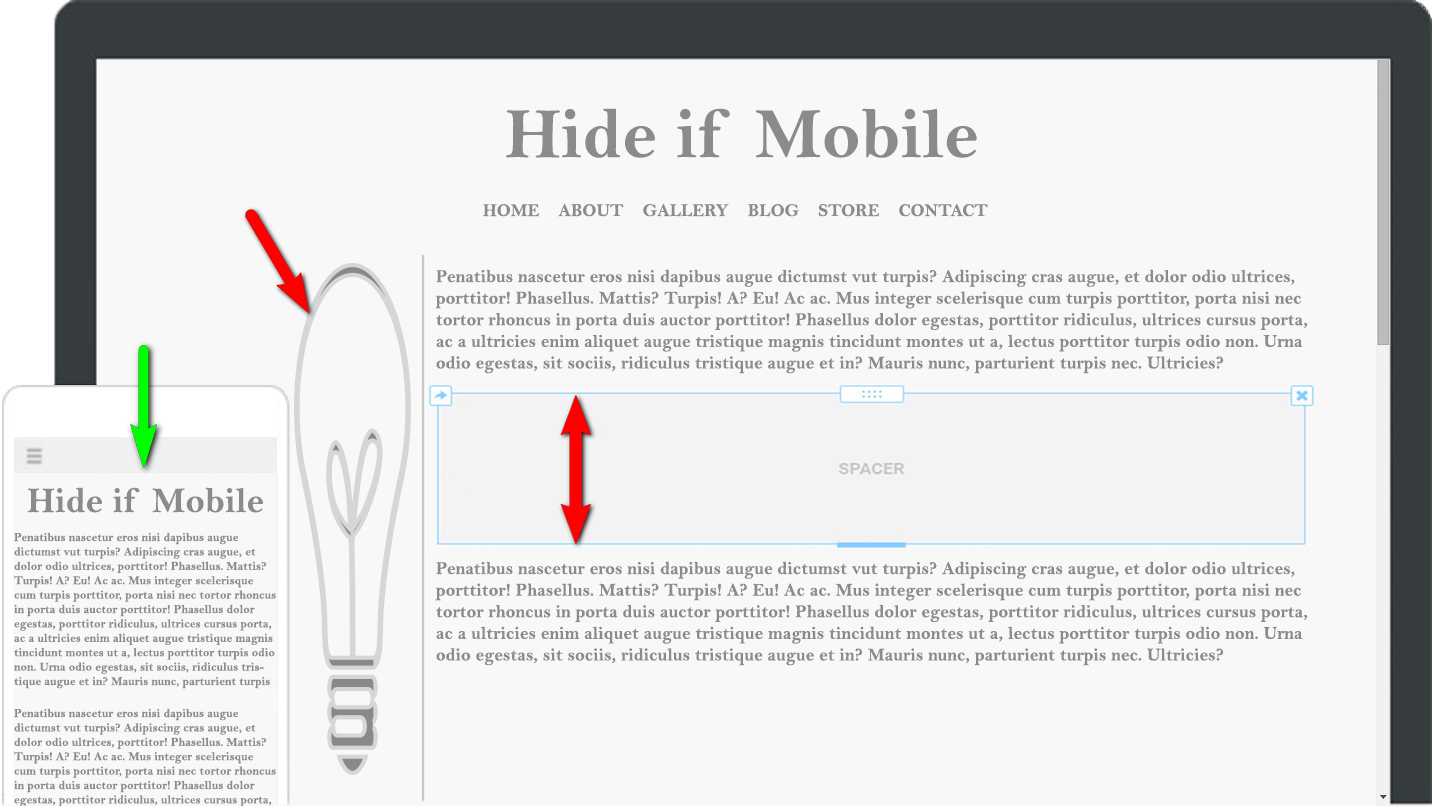
The Hide if Mobile Element allows you to hide content from being displayed while viewing the site from a mobile device.
Example:
When using a Spacer Element to separate content on a page, the spacer leaves a blank space on the mobile version as well. Adding the Spacer to the 'Hide if Mobile' Element will hide the Spacer when the page is viewed from a mobile device.
If you have a tall and skinny image, have Custom Code, a SWF Flash file, or other content that you would like to hide for mobile users simply place the content in the Hide if Mobile element and the content will not be displayed to mobile users.
Cost:
$1.99
Notes:
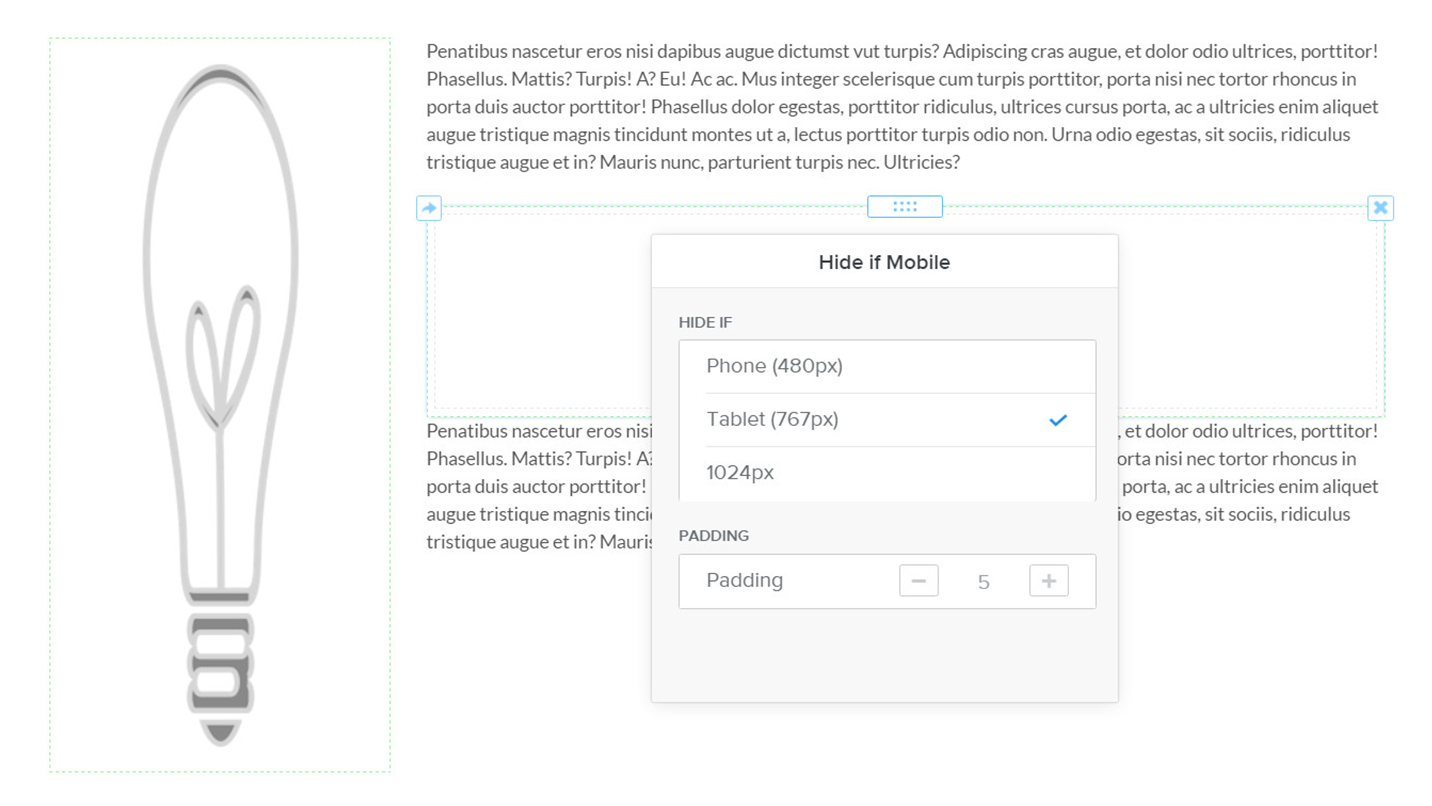
Best if set to Breaking Point in the design of the Theme, or where Columns collapse, currently the default setting 767px.
In the editor, you will see a light green dashed line signifying the Hide if Mobile element is present. The green dashed line will not appear on the published site.
Pricing
$2.58
$6.72
All Features Included.
The number of websites you can add the Hide If Mobile App to.
Use App on a Client Website in the Designer Platform.
Avis
-
Robert MacGillivray Jul 29, 2022Simple and effective. Does exactly what it says on the tin!
-
Paul Arthur Jul 17, 2022This made very light work for a payment processing page I was building using embedded elements. Thank You.
-
Kieran Dhandwar Dec 13, 2021Super awesome to control responsive websites. Used for many years.
-
Utilisateur Weebly Jan 05, 2021This is exactly how a website builder should be. There’s no learning curve with Weebly, so you’ll have your website up and running in no time. Just drag and drop new elements onto your page and click them to edit their settings and features.
-
Kieran Sparrow Jul 06, 2020This app is a life saver. Was seriously struggling to get my site to look great on desktop and mobile at the same time (desktop looked great, mobile was a jumbled mess). With literally 10 minutes of work, this app transformed my mobile site. Works flawlessly, easy to use, does what it says on the tin. A must-have. Can't thank the developer enough!
-
Jonathan Decker May 01, 2020Fantastic app. I was going nuts trying to find a way to do this to make my site sleeker on phones. $1.99 is more than a fair price to fix this issue.
-
[email protected] Apr 23, 2020Wasn't working, support got back to me in minutes, super helpful, we solved the problem, if the app isn't working, you need to check if your theme is stacking columns or not when it goes mobile, ask support for help, they know whats up
-
Robert Nathans Jul 31, 2019Simple, direct, inexpensive. Does what it says. Wish everything behaved this well.
-
Jack Anderson Nov 27, 2018i am so grateful for this app. Prior to my launch with my site just the way I wanted it, I checked out my mobile version to find it a mess. I found the spacing between paragraphs and between headers and text enormous. There were disjointed gaps in each paragraph. It looked awful. The Hide-if-Moble app fixed all the spacing concerns i had. My mobile site is far from perfect but as for my troublesome spacing issues, it is so much better than it was. Thank you!
-
Emilia Prusevicius Apr 03, 2018Solved my problem in a second. Great :)

