
It's time for a brand refresh.
From colors that feel dated to visuals or a logo that popped out of 1999, your brand may be showing signs that it needs new life. But it's important to make changes without losing who you are in the process. (Remember, you don't want to lose or offend people loyal to your small business.)
How do you do it? Here are ways to tackle a refresh that you will love.
1. Make a Subtle Logo Change

Modern logo styles are streamlined and simple. Most contain a visual element of some sort with the brand name, which may or may not always be part of the logo.
Most logos aren't packed with color – one or two colors is common. And there's not a lot of graphic adornment, such as shadows or embossing.
Does this description fit your brand mark? If not, it might be time to simplify your logo somewhat.
You don't necessarily need a new brand mark, but a “flattening" of the logo might be just the fix to make your company name feel a little more 2018. Most brands have adopted a method of subtle logo changes over time, such as Starbucks.
2. Substitute a Typeface
Just as overall logo styles evolve, so do preferences in typography. Simple serifs are popular and easy to read. Script and handwriting fonts – once trendy – are not in fashion because they can be difficult to read and might not set the right tone for all uses.
Most small brands have one or two go-to typefaces for print and online publishing. Swap out one of the older-style options for a more modern typeface.
Not sure where to start? Consider sans serif fonts such as Droid Sans, Lato, Oswald or Ubuntu. If a serif is more your style, try Abril Fatface, Arvo, Josefin Slab or Playfair Display. (The best part? All of these typefaces are already available in your Weebly account.)
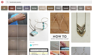
3. Expand the Color Palette
A splash of new color can add visual interest and spice up your brand. Many modern color palettes include bright color choices, including magenta, lime green, orange or bright blue.
Your brand identity might not include colors with so much pop.
Add a complementary color to your existing brand identity for a modern vibe. Just make sure to establish how and when the additional color should be used.
The nice thing about adding a color is that it doesn't have to be a permanent solution. A flashy color choice can link to a specific brand campaign or evolve again when trends change. You also don't have to switch out or contract design of a new logo with this brand refresh concept.
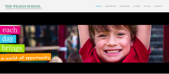
The Wilson School has a dark green primary color, but uses bright colors to help bring attention to homepage messaging in a clear and fun way.
Your brand identity might not include colors with so much pop.
Add a complementary color to your existing brand identity for a modern vibe. Just make sure to establish how and when the additional color should be used.
The nice thing about adding a color is that it doesn't have to be a permanent solution. A flashy color choice can link to a specific brand campaign or evolve again when trends change. You also don't have to switch out or contract design of a new logo with this brand refresh concept.
The Wilson School has a dark green primary color, but uses bright colors to help bring attention to homepage messaging in a clear and fun way.
4. Incorporate a Trend into the Overall Design
Color and typography aren't the only trendy elements that can be a part of a brand makeover. Consider adding another trend to keep the design fresh.
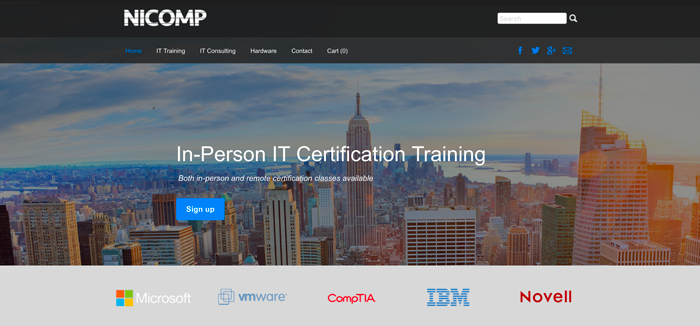
This could include anything from background video on your website to flat style buttons in the design or an image style that mirrors the look of an Instagram filter. Nicomp uses both of these techniques with a filter over the hero photo to make the text easier to read and a flat, blue sign up button on the homepage.
There is some risk with using a trend – it can fall out of style as quick as it came in – but because you are only playing with some visual changes and not rebranding, most small businesses can handle the change.
5. Invest in New Video or Photography
New imagery can make your brand feel new again in an instant. Look at your photo collection. Are the hair styles or clothes from another time?
Little giveaways such as these can make a brand look dated even if it is not. Invest in new photography or video that shows your brand or product in action. Make sure that images are high resolution and are cropped to standard screen sizes. (Wide screen crops are preferred, 16:9 ratio; a 3:2 ratio or medium quality images is a clue that they are old.)
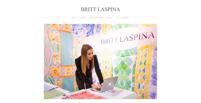
Photo and video composition styles have changed as well, with most brands opting for imagery that looks natural and includes people in action, such as the website for Britt Laspina. Posed or overly stiff photos are out.
Little giveaways such as these can make a brand look dated even if it is not. Invest in new photography or video that shows your brand or product in action. Make sure that images are high resolution and are cropped to standard screen sizes. (Wide screen crops are preferred, 16:9 ratio; a 3:2 ratio or medium quality images is a clue that they are old.)
Photo and video composition styles have changed as well, with most brands opting for imagery that looks natural and includes people in action, such as the website for Britt Laspina. Posed or overly stiff photos are out.
6. Add a Secondary Mark with a Modern Flair
Are you sick and tired of trying to fit your logo into social media profiles or website or app icon locations where it just doesn't display properly?
Most brands create a secondary logo that's very simple, doesn't include text and is easy to pop in these often oddly-shaped or sized locations. The secondary mark signals users that you understand modern tools and the brand is using them appropriately.
If you can go back to the designer of your original logo for a second mark, explain where you want to use it before starting the process. A secondary mark is not just a crop of the primary logo — it is a second, more streamlined logo design.
Conclusion
You don't have to completely rebrand your small business to make a new first impression on users. Sometimes small changes can impact your brand in a big way.
The best thing about making small design changes is that even with an updated look, users will still identify and connect with your brand, while understanding that you want to stay modern in the process.
The best thing about making small design changes is that even with an updated look, users will still identify and connect with your brand, while understanding that you want to stay modern in the process.
 Carrie Cousins Carrie is a designer, writer and content marketer. She works full time in college media at EMCVT and has more than 10 years of media and marketing experience.