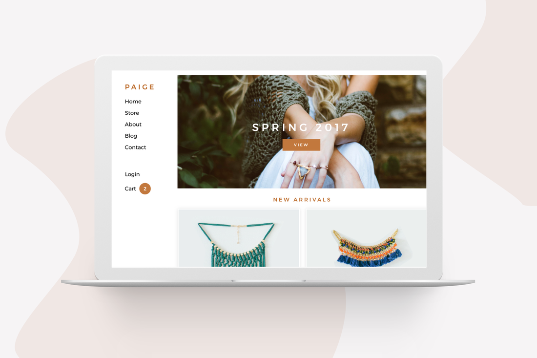
Weebly automatically generates a navigation bar as you build your site. It's great! So great, in fact, that you may not know about a number of other tools that allow you to further customize your site's navigation beyond this built-in bar.
Ensuring visitors can get where you want them to go is hugely important, but there's only so much space available for links at the top of any website. The site editor handles this by placing any excess pages under a "more" menu that expands whenever a visitor scrolls over it. This works very well as a temporary fix, but you really don't want to have lots of pages on your site listed under “more" since that implies they're not very important.
That's why it's best to use your universal navigation to display around three to eight major areas of your site: a link to a Contact page, a Store section, an About Us section, an Events section and anything else that may represent an overarching theme of your site or business.
But then how will you link to all your other pages? Let's take a look.
Drop-Down Menus
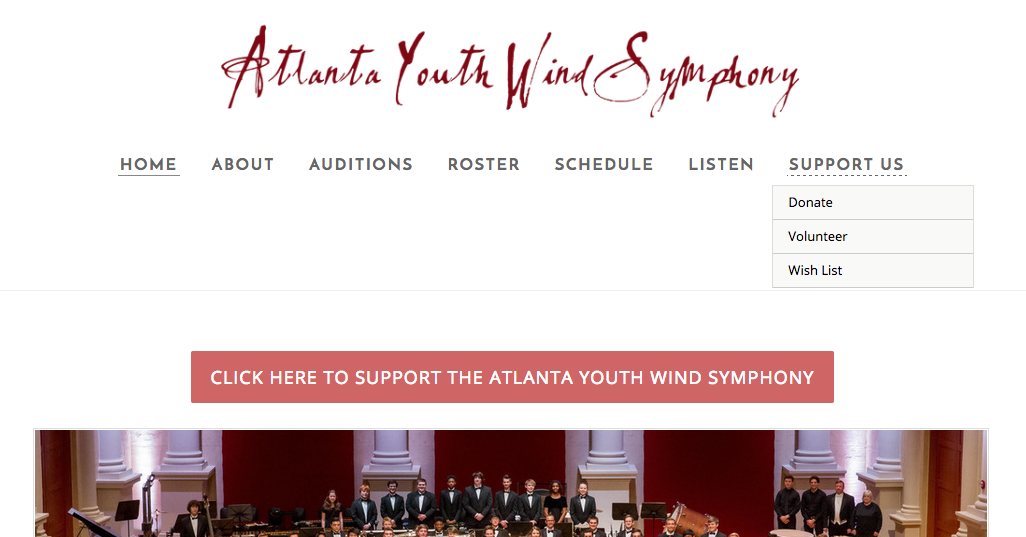
The Atlanta Youth Wind Symphony incorporates drop-down menus into its universal navigation. Scroll over several of its menu items and you'll see these drop-downs in action.
Take “Support Us" as an example. Scroll over it and you immediately see the three ways you can directly support the Symphony: Donate, Volunteer and Wish List, with a page dedicated to each.
This is incredibly simple to do on your own (here's the full guide for it). Visit the Pages tab, then drag a page underneath and to the right of another page to turn it into a subpage.
As easy as these drop-down menus are to create, they really only work well if you put three to seven pages in a drop-down. More than that and you've created a long list that may overwhelm some visitors. Less than that and it looks weird to have a drop-down menu at all.
Table of Contents
There's no reason to limit yourself to putting page links in your site's navigation bar. In fact, it could even be argued that stuffing all your pages there could potentially confuse visitors with too much choice.
That's why sites like Saltopia choose to create their own table of contents for any section of their site that contains multiple pages. Look at their “About Us" page: they've used a Gallery to create links to all their “About Us" related pages. So visitors have images and text to draw them towards each page.
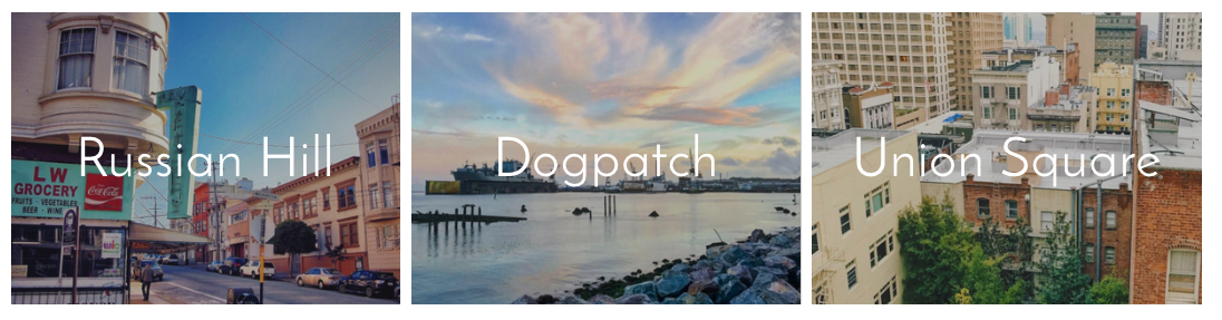
Though slightly more involved than creating drop-down menus, this is still remarkably easy to do. Let's create a small Table of Contents for a shop that has locations in three San Francisco neighborhoods.
We'll start by dragging a Gallery element to a page and uploading three when prompted. We then want to link each image to the page associated with its location, so if someone clicks on an image they go straight to that page. Choosing each individual image allows us to do just that.
That's why sites like Saltopia choose to create their own table of contents for any section of their site that contains multiple pages. Look at their “About Us" page: they've used a Gallery to create links to all their “About Us" related pages. So visitors have images and text to draw them towards each page.
Though slightly more involved than creating drop-down menus, this is still remarkably easy to do. Let's create a small Table of Contents for a shop that has locations in three San Francisco neighborhoods.
We'll start by dragging a Gallery element to a page and uploading three when prompted. We then want to link each image to the page associated with its location, so if someone clicks on an image they go straight to that page. Choosing each individual image allows us to do just that.
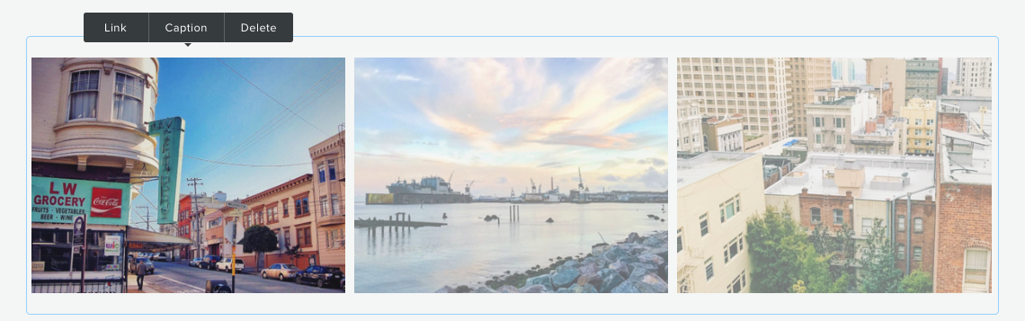
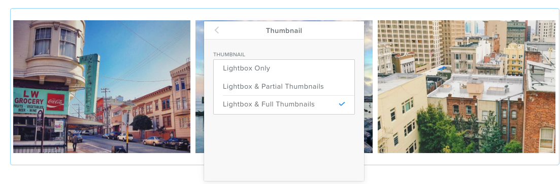
Now we want to add a caption to each image. There's a caption option right next to the link option discussed above. The only issue is that the captions won't immediately show up. It's necessary to change the Gallery settings so that captions show up for “Lightbox and Full Thumbnails."
With this done, we're all set.
You can even combine a table of contents approach with drop-down menus as earthbands.co did with its site. Including both makes it very hard for visitors to ever get lost.
Contextual Links
There's no reason to rely entirely on menus or various tables of contents to guide visitors around your site. You should also use contextual links to tell them exactly where you'd like them to go.
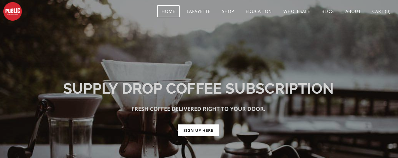
The most obvious place for this in the header section of a page, right underneath the menu. Add a button here that leads visitors to the thing you most want them to do. Public Espresso wants visitors to subscribe to their coffee delivery service more than anything else, so they have a button linking to a page to “Sign Up Here" right in the header.
The most obvious place for this in the header section of a page, right underneath the menu. Add a button here that leads visitors to the thing you most want them to do. Public Espresso wants visitors to subscribe to their coffee delivery service more than anything else, so they have a button linking to a page to “Sign Up Here" right in the header.
Talking about your business on an “About Us" page? Include links in your descriptive paragraphs that direct visitors into your shop. Never let more than a couple of paragraphs go by without directing people back to what you'd ultimately like them to be doing.
Your site will work perfectly fine if you stick with the automatically generated navigation bar, but it will work even better if you go above and beyond like the examples we've seen from the sites above. Well designed and thought out navigation can lead a greater number of potential customers to places where they can spend money with you, which provides at least one situation where you really can kick back and watch the money roll in.
Ready to get started? Lets go.
 RSS Feed