
Color affects how we perceive everything around us, on a deep, subconscious level. When creating a brand, consider the psychology of color — it's a subtle, yet highly impactful piece of the marketing puzzle. Color psychology influences our emotions, perceptions and behaviors.
We are constantly surrounded by options. For any given thing we need, there are more choices than we could ever wish for. This abundance means that customers make buying decisions on an increasingly emotional level. It's no longer enough that a product or service simply does what we need it to, we also want it to make an emotional connection.
“Color is ubiquitous and is a source of information," Satyendra Singh of University of Winnipeg states in a study on the Impact of Color on Marketing. “People make up their minds within 90 seconds of their initial interactions with either people or products. About 62‐90 percent of the assessment is based on colors alone. So, prudent use of colors can contribute not only to differentiating products from competitors, but also to influencing moods and feelings — positively or negatively — and therefore, to attitude towards certain products."
In a world saturated with choice, color makes a difference.
Red: Love, desire, danger
Red commands attention. It's a color that elicits an immediate response and activates our senses. In nature, it signifies danger. This represents passion, love and desire, but also aggression and impulsiveness. No wonder the fast food industry seems to prefer red.

An image with dominant red hues creates a powerful visual presence on the home page of Leo Edwards Photography.
Try it: Customizing your backgrounds and header images is a simple way to add color to your website. You can add a different background to each section and header, giving you endless creative freedom.
Orange: Confidence, cheerful, friendly
Orange is friendly, vibrant and cheerful. It elicits feelings of excitement, confidence and enthusiasm. Seen as attention-grabbing, orange is a particularly good choice for website buttons and calls to action.
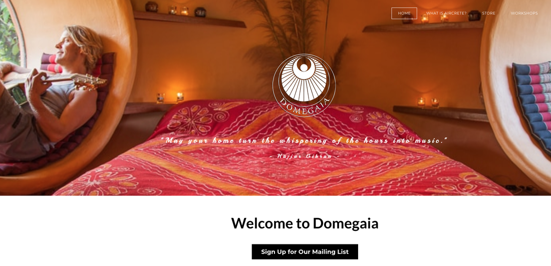
An informational site about eco-friendly home building, DomeGaia uses imagery that is dominantly orange, communicating a sense of warmth and authenticity.
Try it: You can choose custom theme colors for buttons and other calls to action on your website, drawing in potential customers.
Yellow: Youth, happy, warmth
Yellow communicates youth and happiness. Closely associated with the sun, it just seems to have a way to make us feel good. Like orange, yellow attracts the eye, making is a good color to use for accents and areas that need emphasis.
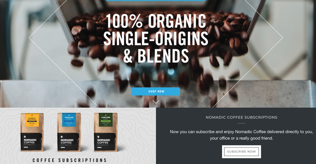
Coffee purveyor Nomadic Ground combines a neutral color scheme with bright yellow accents to highlight specific content.
Try it: Although themes have default font and color options, you don't have to stick with those. Change the look and color of your fonts in order to create impact and emphasis.
Green: Money, envy, nature
Green makes us feel safe and grounded. Because it reminds us of trees and plants, it is often used by brands with an environmental mission. Associated with loyalty, wealth and money, green has often been used by financial institutions and companies who want to convey a sense of trust and quiet confidence.
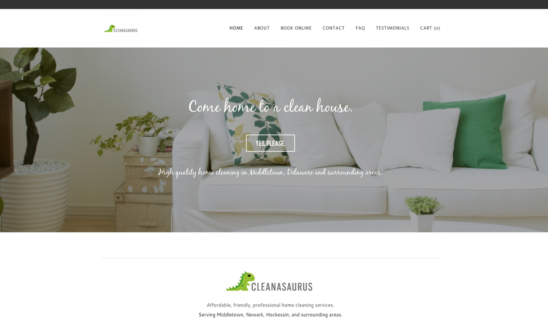
House cleaning service Cleanasaurus combines green accents with lots of white space to communicate a sense of freshness.
Try it: With a minimalist site design, a well-written headline can offer a powerful call to action. Use the block quote element to create expressive text in an accent font.
Blue: Trust, safety
Blue is perhaps the most common branding color, used in the logos of 35% of companies of Forbes' list of the world's most valuable brands. Associated with elements like the sky and sea, blue communicates safety, trustworthiness, responsibility and stability. Blue is generally perceived as a safe choice, which might explain why it is so widely used in the corporate world.
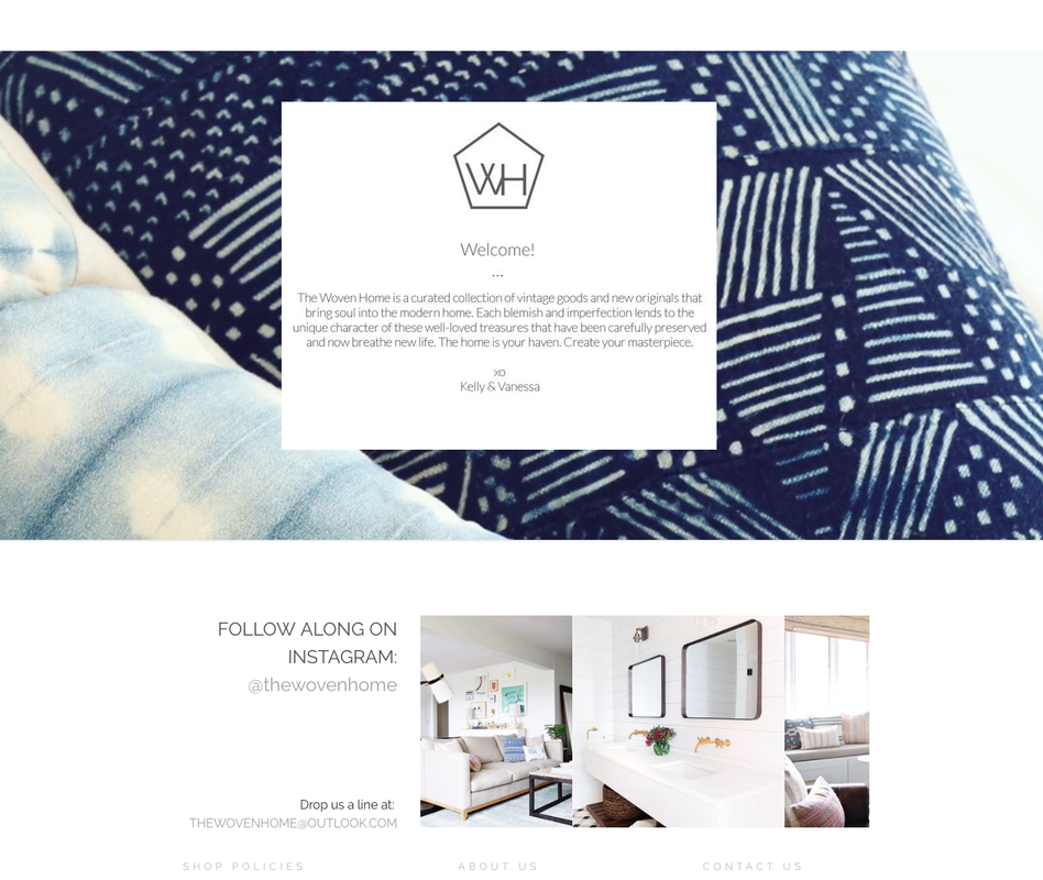
The Woven Home's header imagery features a product close-up in soothing blue hues, communicating a sense of comfort and safety.
Try it: Flexible headers enable you to add and remove elements, customize the background and height of the header area, so that it feels just right for your business.
Purple: Royalty, creativity, spirituality
Purple represents luxury and creativity. It is, however, not a very common brand color. Only 1% of brands of Forbes' most valuable list use purple as their signature hue. Because of its connection to spirituality, purple is often used by yoga and health food brands.

Using a graphic pineapple pattern and purple-to-yellow gradients, yoga clothing brand Flexi Lexi conveys a down-to-earth sense of fun.
Adding color gradients to your site is a fun way to incorporate visual interest and help your content stand out.
Consider coolness or warmth
On a basic level, color is on a spectrum of cool to warm. Cool colors communicate calmness and generally feel more reserved while warm hues are more energetic and cheerful.
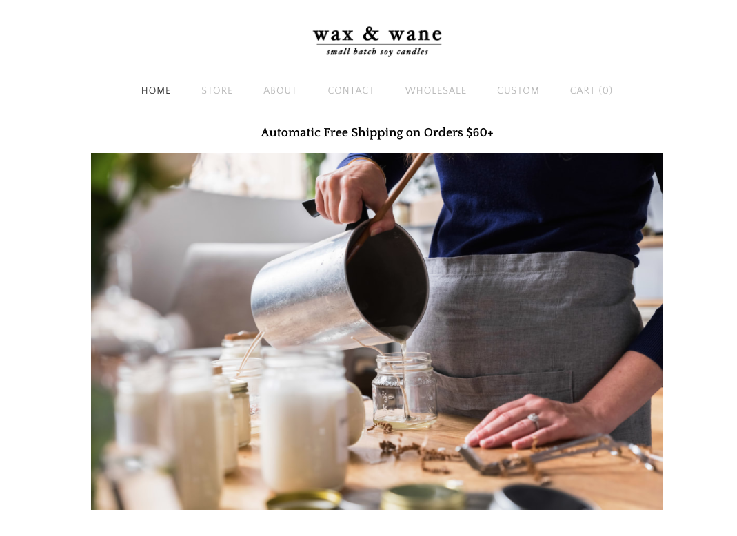
Candle company Wax & Wane combines a simple website layout with photography that feels warm and cozy.
Try it: If you have a lot of good stuff to show, you don't have to stick with just one header image. Create a slideshow of multiple images to showcase different products or aspects of your business.
Evaluate intensity
Color intensity also matters. A bright green feels very different from a subtle pastel shade of green. More subdued colors feel soothing and communicate a quiet elegance and warmth. Bright hues feel young, happy, and modern.
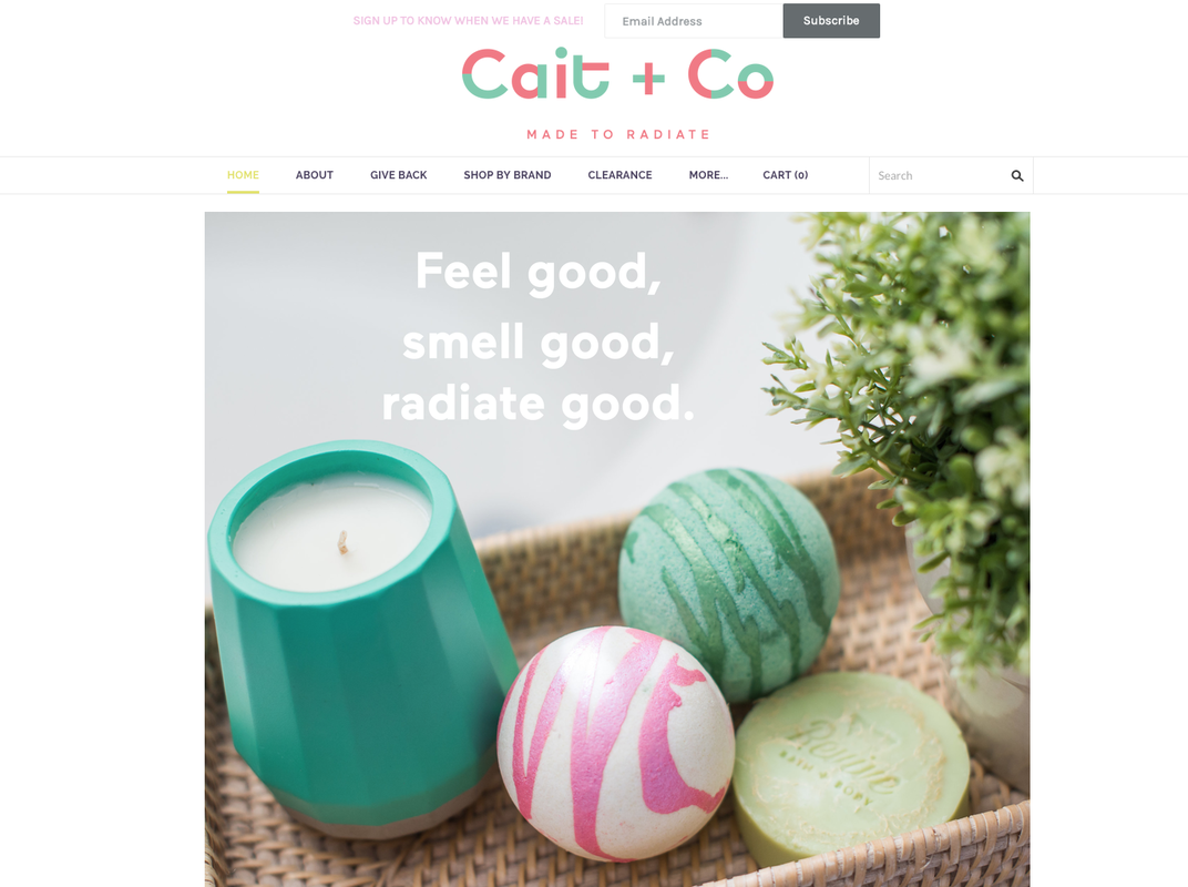
Personal care product company Cait + Co uses bright color accents to convey a sense of playfulness and fun.
Try it: Staying current is important. If you feel like your site needs a facelift, switching themes is easy breezy.
Remember Restraint
Sometimes, the best way to approach color is to simply abstain from it. Designers and luxury brands tend to favor non-colors like black and white because they represent a certain sense of sophistication
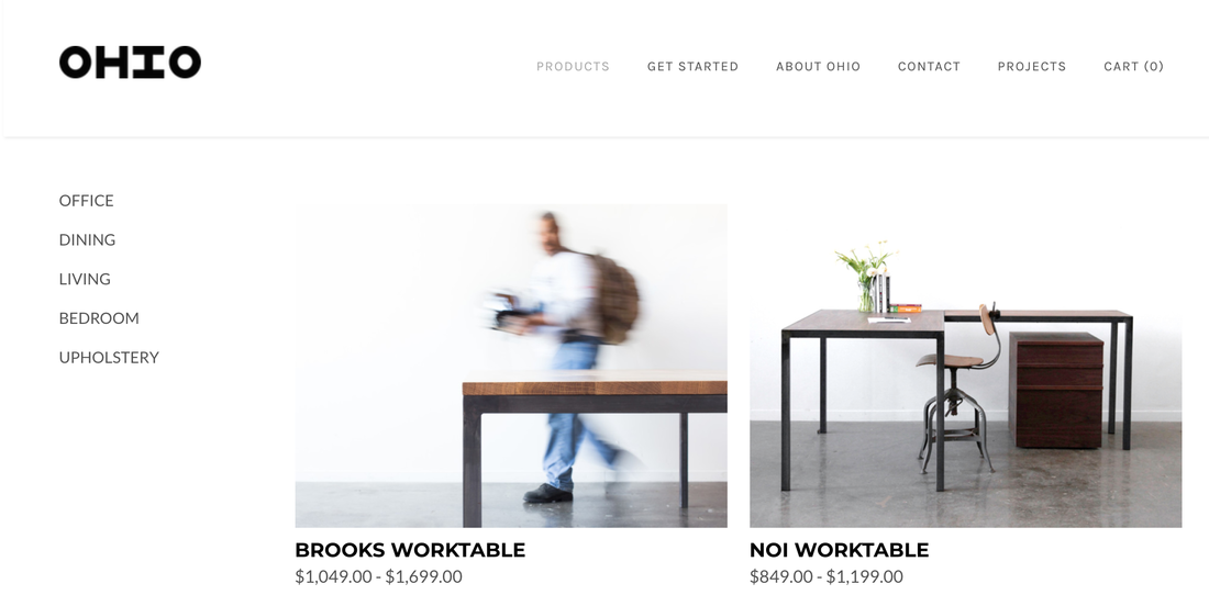
Furniture company OHIO Design's site is simple and minimalist, allowing the product to stand out through great photography.
Try it: Choose a theme that best represents your brand. Simplicity and minimalism have grown immensely in popularity over the past few years. When in doubt, it's always a good idea to keep the design as pared down as possible — letting your product shine through. Great photography is an essential component of any site (and brand) and offers a great opportunity to incorporate color.
When choosing a color scheme, think about how it makes you feel. Think about what emotions particular colors convey and ensure that those are the feelings you want your product or service to elicit. From a psychological standpoint, color may just be your most important branding tool.
 RSS Feed