The use of cards and tiles is a popular website design trend. This framework is effective because it has a clean and organized look and feel while easily adapting to a variety of device sizes. But you don't want to create a design that looks like Pinterest. A card-style framework should be unique and highlight your brand. Here's how to do it.
What is “Card" Design?
Card or tile style design features stackable blocks. Each block contains a piece of content – images, text or links – and fits like a grid on the page. This design technique is popular because of its flexible style and is used by some of the biggest websites in the world (just look at social media giants Facebook and Twitter).
You should consider using cards if the goal of your website is to do any of the following:
Cards and Images
The framework for many great cards starts with a big image, but not just any image. The photo or illustration needs to be something that is clearly identifiable and reads well at almost any size, particularly small sizes.
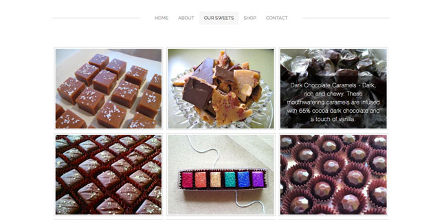
Rose City Sweets entices users with great images of confections. Each photo includes a hover state that describes the item and is designed to be shared on social media.
Card or tile style design features stackable blocks. Each block contains a piece of content – images, text or links – and fits like a grid on the page. This design technique is popular because of its flexible style and is used by some of the biggest websites in the world (just look at social media giants Facebook and Twitter).
You should consider using cards if the goal of your website is to do any of the following:
- Work on a responsive framework with a consistent design across devices
- Organize varied or large amounts of content
- Share pieces of information on multiple platforms
Cards and Images
The framework for many great cards starts with a big image, but not just any image. The photo or illustration needs to be something that is clearly identifiable and reads well at almost any size, particularly small sizes.
Rose City Sweets entices users with great images of confections. Each photo includes a hover state that describes the item and is designed to be shared on social media.
Pro tip: Consider whether each card should be uniform in shape and size or have a fixed width (best for responsive breakpoints) and flexible height.
Cards and Text
A card does not have to include an image to work well. Some of the best website cards feature great text. When paired with images, text should be kept to a minimum, usually no more than five to 10 words, or a single sentence. When used alone or over an image, website designers have a little more leeway with the amount of text used, as long as lettering remains bold and readable.
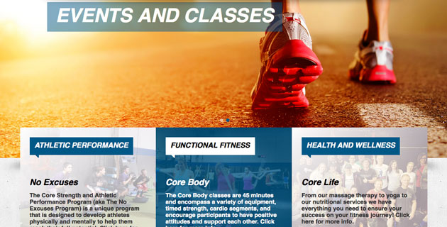
Core Athletic uses a text-style card with heavy bold lettering over faded images with a great hover state to make reading even easier. This card design can also work with a solid color background.
Pro tip: Leave plenty of space between text and the edge of each card to ensure that every word is easy to read.
Cards and Calls-to-Action
Every card should include a specific call-to-action. This action can be anything from clicking to "read more" or "buy a product." Each card should be a button in itself, with a design rule of one action (or link) per card.
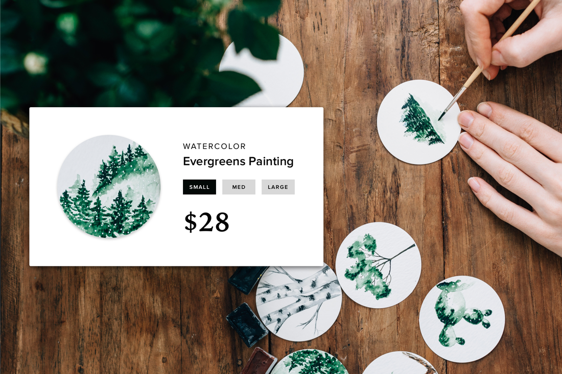
A Northern Light uses image cards with hover-state pricing to entice users to click on specific prints for sale. The subtle call-to-action is effective and helps users navigate to the page to buy each print.
Pro tip: Include a button style in the card if the content does not lend itself to an obvious click.
Cards and Social Sharing
With roots in the design of social sharing site Pinterest, it is no wonder that card style design is popular because it is easy to share. Encourage sharing with images and cards that are sized to pin or post to social media sites. Highly visual cards work best when it comes to sharing and images should include something that users will be interested in even if they are not familiar with your product or brand.
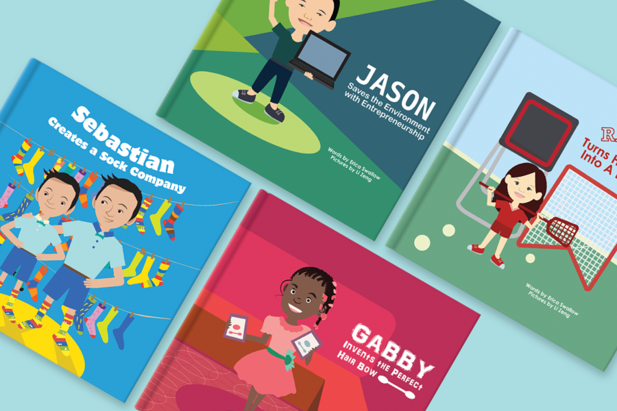
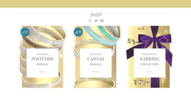
Whistle & Bango uses cards to highlight different product lines. Each card is a shape and size that will render nicely on Pinterest and showcases the uniqueness of each item.
Pro tip: Include a social sharing icon or “Pin It" button to encourage even more sharing.
Cards and User Interaction
The goal of a card-style design is to encourage user interaction and clicks. Techniques such as neat hover states, AJAX scrolling to keep cards populating on the site and obvious clickability can make the design even more effective.
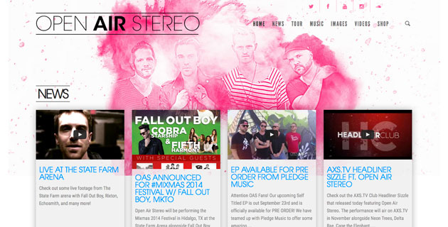
Open Air Stereo uses a clean, flat card design style featuring an image and text to get users to interact with content, such as videos, photos and blog posts. Each card includes a fun “bouncing" hover state that is hard not to click.
Pro tip: Pick one user interaction trick per website design. A cool hover state, animation or AJAX scrolling can work great, but too many techniques can be overwhelming to users.
Conclusion
Card-style website design can make it easy to organize content in a responsive framework. The design trend is popular because it encourages clicking elements on the screen, and can make it easy to convert shoppers to buyers when used for retail-based websites.
 Carrie Cousins Carrie is a designer, writer and content marketer. She works full time in college media at EMCVT and has more than 10 years of media and marketing experience.
