Google’s much-anticipated Mobilegeddon has come and gone, and generally speaking it seems that the fear and loathing we experienced during the run-up were a bit over the top.
There’s a great chance that your site dodged a penalty from Google; however, that’s not the same as getting a stamp of approval for your mobile website. Unfortunately, even if you have a mobile site, it doesn’t mean you have a mobile-friendly, mobile-effective or mobile-useful website. Here are some of the most common traps website designers – both DIYers and professionals – fall into. Avoid them at all costs!
Color me bad
On one of the gorgeous screens we have today on our laptop and desktop computers, a website home page full of variations in shades of related colors can look absolutely beautiful and really get the attention of an Internet user. However, that kind of subtly doesn’t translate to the small screen on a smartphone.
We can get too artistic. Ultimately your website is a tool to communicate information to people. If the colors you choose handicap the ability of your mobile site to communicate its message, you’re making a big mistake.
Keep your colors pleasing, but stick to more “middle-of-the-road” hues and be sure you have sufficient contrast to make type readable.
Size really matters
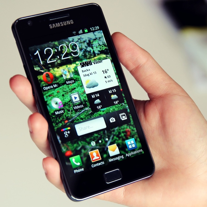
There’s really no question that you should have a mobile site and the purpose of your mobile site is to make things convenient for your website visitors. Further, in many cases these people are your business prospects. I can’t tell you how many times I’ve pulled up the mobile site for a restaurant and the type was so small it was virtually unreadable.
Worse yet, often we’re in our cars at times like these – hopefully as passengers, not drivers – and between the car’s movement and other distractions, it’s already difficult to focus. Don’t make your mobile website visitors struggle to read the copy on your website.
Keep the type big enough to be read easily in a challenging environment.
Where’s the info hiding?
What information is critical to deliver to your mobile website visitors? If you can’t answer that question, don’t start designing your site until the answers become clear.
For many website owners, basic information such as phone number, location and business hours is the most important for their mobile site visitors. If those details are buried on internal pages or at the very bottom of a long home page, they are doing their customers a disservice.
How will people contact you from the road? Is your phone number clearly visible and is it formatted in a way that will auto-dial? People don’t enjoy entering tiny text into contact forms on their smart phones, so don’t depend on that system of contacting you.
What about a map? If you have a physical location people need to find, be sure you provide easy map access.
If you’ve done your SEO work and local citations are driving people to your mobile website, you don’t want to lose them. Be sure that your homepage instantly communicates the information you want people to have.
Remember that with your mobile website you’re creating a tool – not the next Mona Lisa.
Photo Credit: Philip Jägenstedt/CC0
 Megan Totka Megan is the Chief Editor for ChamberofCommerce.com. ChamberofCommerce.com’s platinum membership program helps small businesses grow on the web.


