Make the most of gradients by using them as a background. Popular options include a shift from one bright color to another and subtle light to dark gray tones.
The best parts about using gradient backgrounds is that they are easy to change and create. Not sure where to start? Use at least one color from your palette for the gradient. If you plan to use text on top of it, opt for two colors that are light (for dark text) or dark (for light text.
Linear (and linear rotated) gradients are the most popular options. A linear gradient changes from one color to another in a straight line pattern, whereas a radial gradient emanates from a colored circle outward.
Try it now: Every Weebly website comes with the ability to customize the background. Use a tool such as Canva to create a gradient that matches your landing page design and import the gradient as an image background to your website.
The movement of a video header can entice users to come to your website and engage with the design. It can provide an extra level of information about your product or service that still images or words alone can't portray. And, frankly, users just love it.
Food Blogger Pro noted that simply switching to a video increased their conversion rate by 138 percent. (Now, that's a trend that pays off!)
Video headers can be particularly effective for certain types of websites:
- Ecommerce to provide product information and context
- Businesses, services or organizations to show what you do
- Blogs with video to help users “experience" events or activities
- Restaurants, hotels or art galleries to showcase locations and ambiance
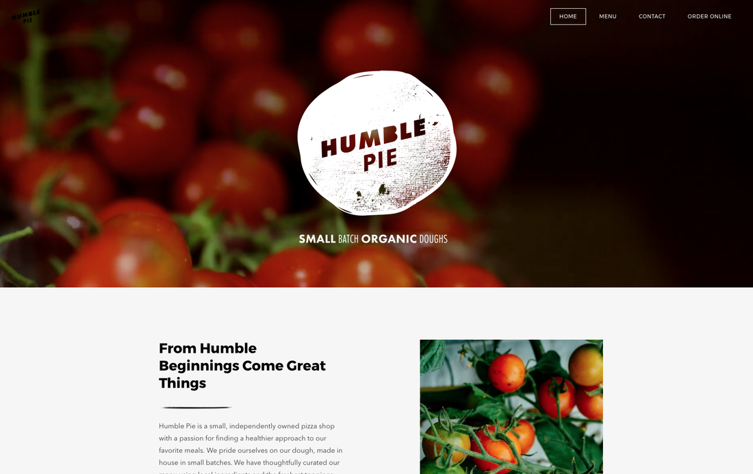
Try it now: Weebly Pro, Business and Performance plans make it easy to add video backgrounds from within the section element or during header customization. Upload your own video or choose from a gallery of curated options. For inspiration, check out Humble Pie's excellent homepage video header.
For a website design that don't contain an overwhelming amount of content, a long scrolling design can help create organization. It also makes it easy for a user to get every bit of information they need, plus a call to action, in one location.
The trick to a long-scrolling design is to think of the website in terms of “screens," or everything a user will see at one time. Each screen should contain a new thought or call to action, almost in the way new pages would. (You can even link navigation elements to areas of the long scroll so users can still jump around to relevant content.)
Try it now: Many Weebly themes are perfect for when you want to build a simple website with everything on one long-scrolling page. Try Typo Designs, Bayside Inn or Backstage to get started. You can enable parallax and reveal scrolling effects when using sections to build your website.
The nice thing about all three trends above is that you can incorporate them into the design in a matter of minutes without having to recreate your website. (Or you can plan for them if you are just starting from scratch.) With trends, the best use is limited, so pick the concept you like most for your website design and leave the others for someone else.


 RSS Feed